
Hi, I'm Rasmus Kampmann
Data Analyst | Business Intelligence Specialist | Power BI Developer
📊 From Ops & Marketing → Data Analytics: Automating Reporting & Simplifying Decisions
💻 SQL, Power BI, Excel, Automation
🏃♂️ Fitness, Sports, Travelling
📍Barcelona, Spain
SKILLS
What I Do

Power BI
I build interactive dashboards that turn messy business data into clear, real-time insights.

Excel
I analyze, clean, structure, and validate data — creating a solid foundation before automating or loading it into databases.

SQL
I query and transform data to create reliable, analysis-ready datasets for dashboards and reporting.

Python
I use Python for automation, data processing, API integrations, and deeper analytical tasks that require more flexibility than spreadsheets.

Supabase
I use Supabase as a structured, queryable database to store cleaned data, support analysis, and feed automated reporting pipelines.

n8n
I use n8n as the automation layer that connects everything — moving data between systems, triggering workflows, running AI agents, and removing repetitive tasks.
EXPLORE MY WORK
My Projects

Veginova Case: Real-Time Sales, Inventory & Production Insights
A unified BI pipeline connecting sales, inventory, and production data to a real-time Power BI dashboard, improving visibility and reducing manual reporting.

Automated BI Pipeline: Real-Time Reporting in Action
An automated BI pipeline that transforms raw data into real-time dashboards enriched with AI-powered insights—reducing manual work and improving decision-making speed.

DoorDash/iFood Performance Insights (Excel)
An Excel-based analysis of delivery platform performance, evaluating customer behavior, order patterns, and operational metrics to identify drivers of revenue and efficiency.

Healthcare Operations Analysis (SQL)
A SQL-driven analysis of hospital operations, focusing on patient readmissions, visit patterns, and performance KPIs to support better planning and resource allocation.

Python-Driven Manufacturing Insights
A Python workflow analyzing production metrics, identifying inefficiencies, and extracting insights from raw manufacturing data to support operations and forecasting.

Real-Time Market Intelligence Dashboard
A dynamic dashboard that aggregates competitor and market data to deliver real-time insights, helping businesses track trends and make faster strategic decisions.

Supply Chain Insights in Power BI
A Power BI dashboard giving clear visibility into inventory, sales, and logistics—helping teams spot bottlenecks and make faster decisions.

End-to-End Data & AI Automations
A collection of scraping workflows, enrichment engines, AI agents, and automated pipelines designed to eliminate repetitive tasks and improve data quality across operations.
LEARN MORE
About Me
Hi - I’m Rasmus.I build simple, reliable data systems that turn messy operational data into clear insights and automated reporting.Through my work at Veginova and Sira Logic, I’ve designed BI models, automated data flows, and connected datasets across sales, inventory, production, and ERP sources.My focus is always the same:
Create structure → automate routine work → deliver dashboards that support real decisions.
What I Work With
Power BI · SQL · Python · Excel · Data Modeling · Automation (n8n / Power Automate)
How I Approach BI
I prioritise:• Clean, consistent data structures
• Automated ingestion & transformation
• Lightweight pipelines over complex systems
• Power BI models that are easy to maintain and expand
• Dashboards that highlight business logic - not noiseI reduce operational friction by replacing manual spreadsheets and inconsistent processes with systems that run on their own and make the business easier to understand.

3+ YEARS OF EXPERIENCE
Previous Experience
Veginova Seeds
Apr 2025 – Present
Data Analyst & Business Intelligence Specialist
◾Built automated data workflows and BI dashboards for real-time visibility across sales, inventory, and production.
◾ Created reporting automations using Python, SQL, and n8n to streamline weekly data operations.
◾ Structured Veginova’s core datasets in Supabase to improve consistency and simplify analysis.
Sira Logic
Jun 2024 – Aug 2025
Data Automation Consultant
◾ Built automated scraping systems to collect structured market and competitor data.
◾Developed AI-driven workflows for enrichment, scoring, and lead-generation automation.
◾ Created Python/SQL pipelines and LLM chatbots to streamline data operations and client interactions.
Veginova Seeds
AUG 2023 – Apr 2025
Operations & Marketing Data Coordinator
◾ Introduced automated lead-sourcing workflows to reduce manual prospecting.
◾Built a lightweight market-intelligence tool to improve competitor and customer visibility.
◾ Improved B2B reporting workflows by streamlining product and account performance data.
Evaluating School Success with Tableau Project
In the state of Massachusetts, there are approximately 953,748 high school students, which is almost a million kids! This means that decisions regarding high school education affect one-seventh of the state's population, which is 6.985 million.
Background
The state of Massachusetts asked to analyze their education data. The Secretary of Education is exploring ways to increase college attendance, including investing in building more schools. One idea is to lower the average class size in hopes of boosting the percentage of students attending college. Using Tableau we have taken a deep dive into the data.All the data is available to look at yourself on this.The original dataset can be found here.

Analysis
I was stunned to learn that last year, 162,137 students did not graduate while 791,610 students successfully graduated.Another 205,818 did not attend college, while 585,791 students proceeded to pursue
higher education after graduation.As per the state's request, I looked at the correlation of class size.The average class size for the entire state is 18, however, the top 5 schools have the largest class sizes. While class size may not be a significant contributor to student grades. There was more data to look at.

Next, we looked at who could help other schools.The top five schools in fourth-grade math proficiency are Hingham, Winchester, Lynnfield, Manchester, and Sherborn. Reaching out to these schools to discover how they are aiding their student's success will be important.

Then we identified schools needing the most urgent help.The schools that are currently struggling the most with their grade point average. These schools include Springfield Public, Boston Charter, Whaling City Junior, Springfield High, and Phoenix Academy. They could benefit greatly from some assistance and that would be a good place to start.Lastly, we found the most helpful piece of information!When it comes to struggling schools, an average of 77% of their students are economically disadvantaged. In contrast, only 13% of students in the top 5 schools face the same situation.According to the state, children who use one or more assistance programs are at a disadvantage.

Conclusion
I recommend reaching out to the high-performing schools and inquiring if they would be willing to share their successful strategies with the lower-performing schools.Instead of investing in building more schools, we should focus on improving or expanding the programs that help economically disadvantaged children. This would be a more effective use of resources.Lastly, It would be beneficial to contact colleges and share this information with them to explore if they're willing to assist high schools in enhancing the transition to college.If you enjoyed reading this. Please connect with me on LinkedIn. I'll be posting more like it. This project was done as part of the DAA Boot Camp Projects. Educational purpose.
AI-Augmented Business Intelligence Pipeline

See the system in action - from raw file upload to AI-generated insights and Power BI connection.
Overview
This project started from a simple question:"How do I give companies clean, reliable insights without needing a full data team?”To answer it, I built a lean BI pipeline that:
Converts messy CSV/Excel files into structured SQL tables- Auto-generates visual insights
- Connects directly to Power BI for live dashboards
- Includes an AI assistant that answers questions about the dataIt’s also the foundation for the freelance analytics solutions I deliver.
1. File Upload → Automated Processing
Users upload a raw CSV/Excel file.
The system automatically:- Reads the schema
- Cleans key fields
- Normalizes formats
- Stores it in Supabase (Postgres)
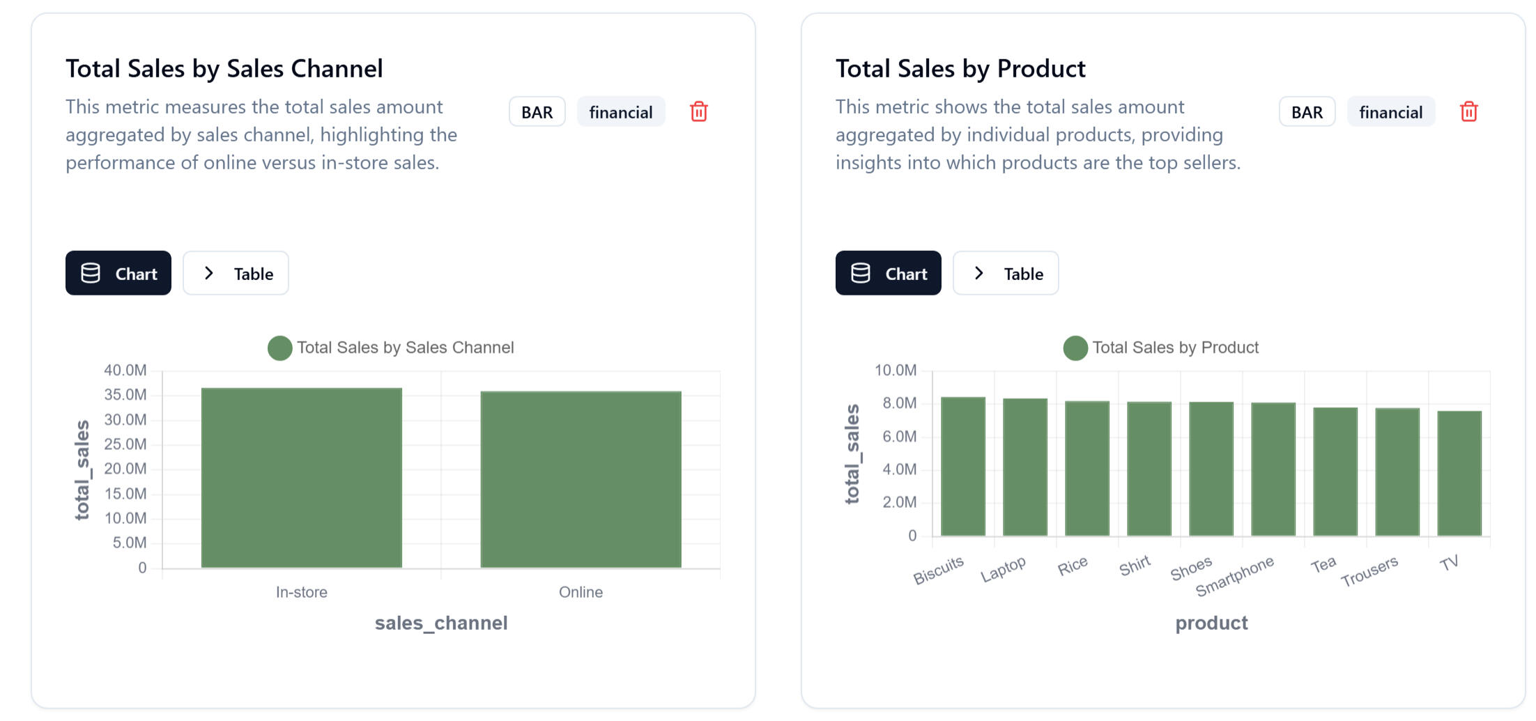
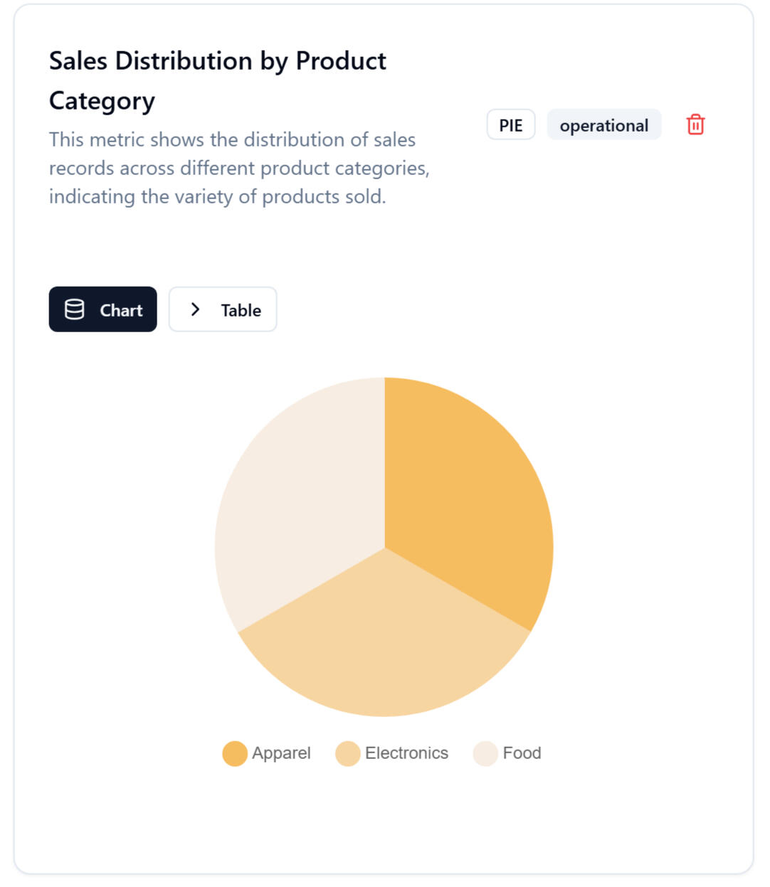
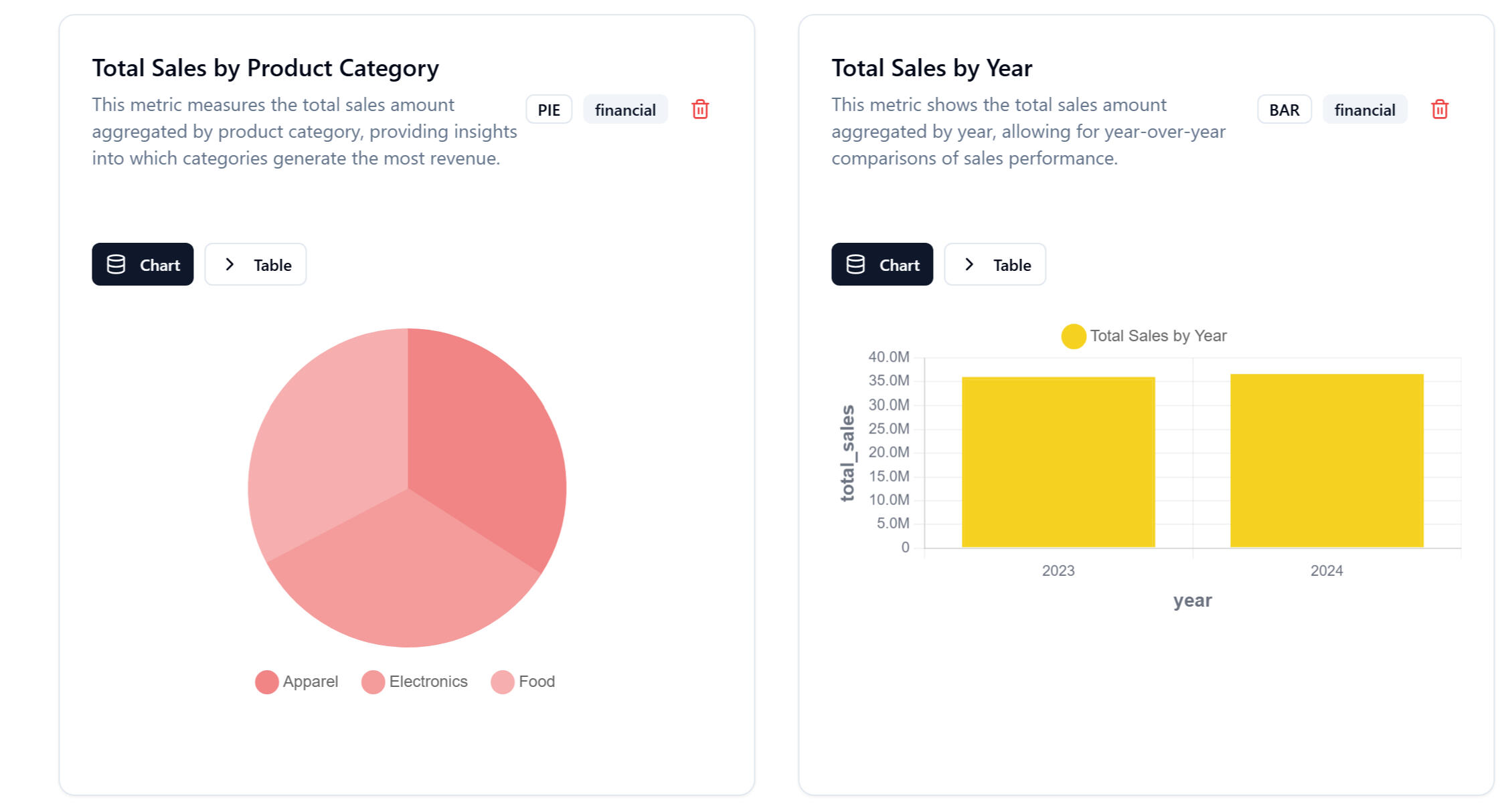
2. Auto-Generated Visual Insights
Right after uploading, the platform displays:- Sales distribution
- Revenue by product
- Online vs in-store performance
- Year-over-year comparisons
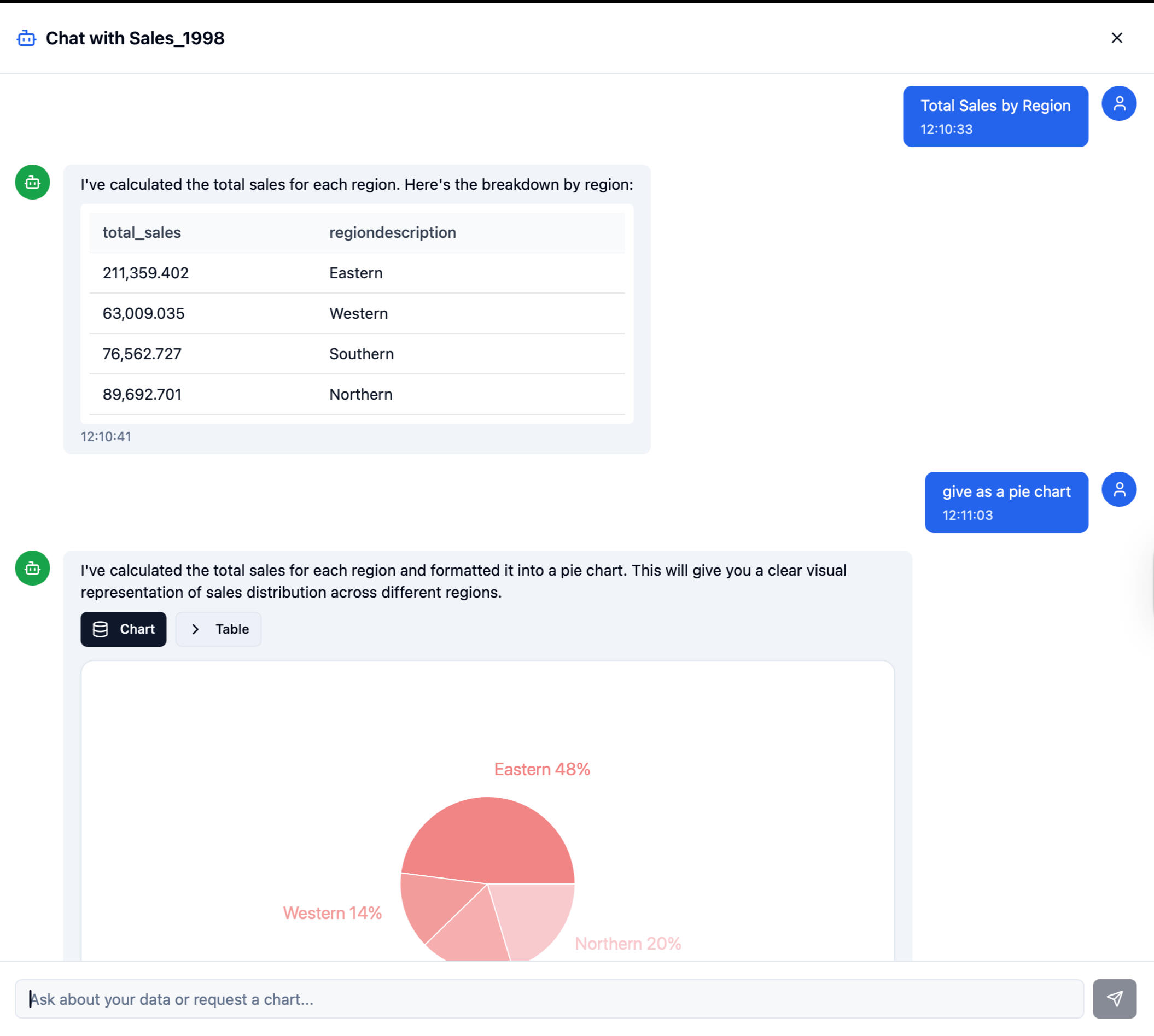
3. AI-Powered Data Assistant
Users can ask questions in natural language:“Which products sold best this year?”
“Show me sales by channel.”The LLM translates this into SQL → executes → returns summaries or charts.
4. Power BI & Tableau Integration
The system exposes clean SQL tables through Supabase.
Recruiters love this part because it shows you understand real BI workflows:- DirectQuery or scheduled refresh
- Fact/dimension schema
- DAX-ready data modelThis is where your BI skill kicks in.
Architecture Overview
Plain English version of the system:1. Supabase (Postgres) – single source of truth2. Python ETL – clean & standardize uploaded files3. SQL Views – star schema for BI modeling4. LLM layer – natural language querying5. Custom UI – upload + analytics + AI chat6. Power BI connector – live dashboards for end usersThis is intentionally lightweight and realistic for SMEs.
Architecture Overview
This project shows recruiters you have the rare combination of:
✔ BI fundamentals
- DAX- Modeling: fact/dim- Power BI visuals- KPI creation- Data storytelling
✔ SQL + database structure
- Normalizing messy data- Designing schemas- Writing queries optimized for BI
✔ Automation + AI integration
- LLM → SQL pipelines- Automated insights- Practical ETL thinking
This is the exact hybrid BI profile companies want in 2025.
Challenges & Lessons Learned
What made this project real:- You cannot over-automate BI - interpretation is the real value
- Dirty data is the bottleneck, not dashboards
- AI depends 100% on clean structure
- Building useful tools means keeping the stack simple, not enterprise-sized
- Power BI only makes sense when the modeling is cleanThis project forced me to learn the pieces that actually matter in BI.
What Comes Next (Short Version)
Power BI Development
KPI dashboards, DAX models, automated reporting
Value: Gives companies clear visibility into sales, finance, and operations.
SQL + Supabase Backend
Clean schemas (fact/dim), data modeling, transformations
Value: Ensures reliable, scalable, and query-ready data for analytics.
Workflow Automation (n8n / Power Automate)
Automated data ingestion, validation, refreshes
Value: Removes manual work and reduces errors in reporting.
AI-Assisted Analytics
“Ask Your Data” chat interface, automated summaries
Value: Makes insights accessible to non-technical users instantly.
SME BI Starter Kit (Long Term)
Standardized data model + ETL + dashboards + AI layer
Value: Plug-and-play analytics for small businesses without a data team.
From Raw Numbers to Revenue: A DoorDash Business Intelligence Analysis
Data helps us make decisions, but only if we can separate the signal from the noise.I recently dove into a massive dataset- structurally similar to DoorDash’s customer marketplace- to see if I could uncover exactly what drives profitability. I chose this project because platforms like DoorDash operate on massive volume and real behavior. It is the perfect environment to apply Business Intelligence (BI) thinking: millions of small decisions happening daily that ultimately dictate customer lifetime value.My goal was simple: I wanted to move beyond "fancy dashboards" and discover the actual mechanics of customer behavior. Here is how I turned raw operational data into actionable business strategy.
1. The Clean-Up: ensuring Integrity
Before analyzing a single trend, I had to ensure the data was reliable. I started by scrubbing the dataset for duplicate records.
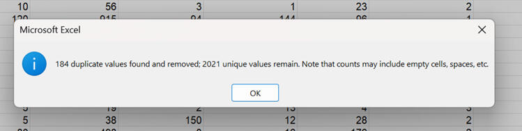
I removed 184 duplicates, leaving us with a clean dataset of 2,021 unique customer entries. This step is crucial - without it, any insight we find later could be biased or inaccurate.
2. The 30,000-Foot View
Once the data was clean, I created a dynamic summary table to get a pulse on the overall metrics. Using aggregate functions like SUBTOTAL allowed me to keep these numbers flexible as I applied different filters later on.
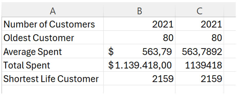
Right away, we can see that the average customer spends about $563, contributing to a total revenue of roughly $1.1 million.
3. Drilling Down to the Individual
While aggregates are great for strategy, sometimes you need to look at specific accounts. I utilized VLOOKUP to create a tool that links specific Customer IDs directly to their spending habits.

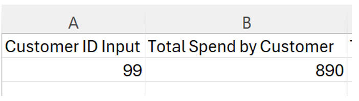
In this example, we can instantly see that Customer #99 is a high-value user with $890 in total spend.
4. The "Why" Behind the Spend
Now, for the interesting part: What makes a customer spend money?I suspected income played a role, so I plotted income against total spending. The results were undeniable.
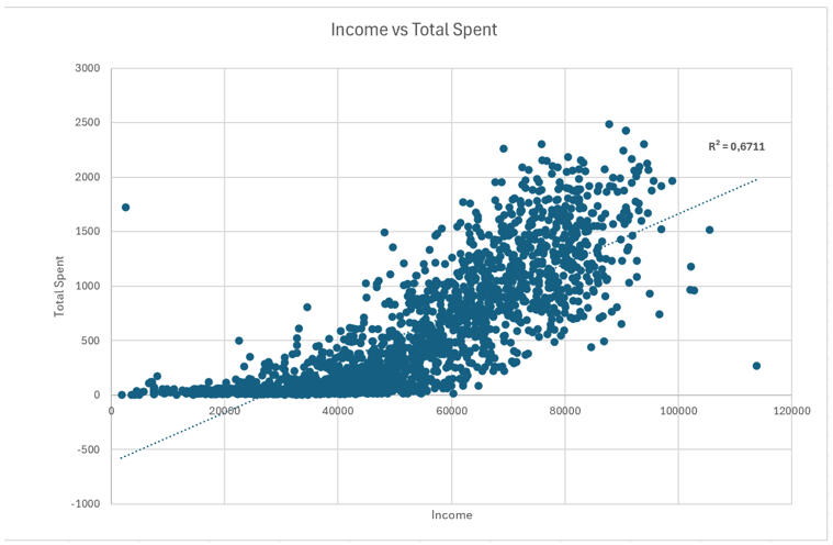
There is a clear positive correlation here. As income rises, so does spending11. With an $R^2$ value of 0.67, we know that about 67% of the variation in spending is explained purely by income12. This suggests our premium marketing efforts should be laser-focused on high-income demographics.However, not everyone is a "whale." I looked at the distribution of spending across the user base:
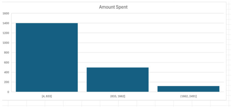
The data is right-skewed. The vast majority of customers fall into that first bucket ($4–$833). This tells us that while we have a massive base of occasional users, our revenue is heavily driven by a smaller, high-value group that spends above $1,600.
5. Cracking the Code on Segmentation
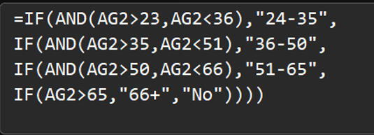
To capitalize on these high spenders, I needed to know who they were. I used nested IF functions to categorize customers into specific age bins (24–35, 36–50, 51–65, and 66+).
I then analyzed Campaign 6—the strongest performing marketing campaign of the bunch - to see how these age groups reacted.
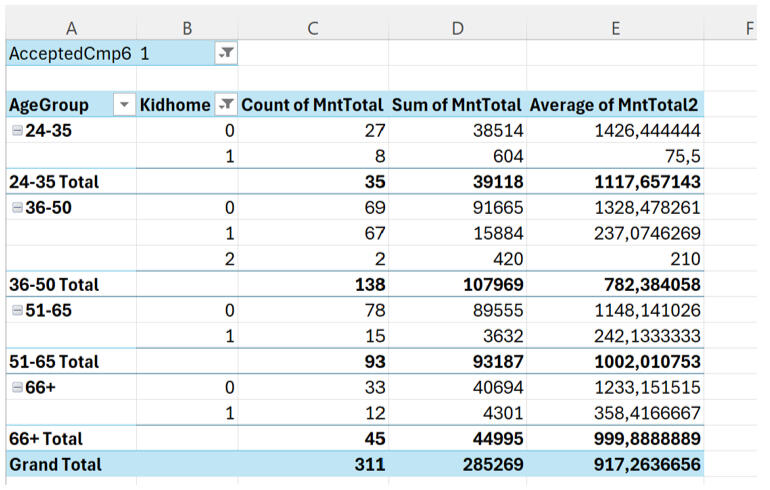
This was a major revelation. The 36–65 age group is the clear revenue driver.24–35 year olds: Lower total spend and lower average spend.36–65 year olds: Highest participation and highest total spending.This proves that middle-aged customers are the most responsive and valuable segment for this platform.
6. Timing the Market
Finally, I wanted to know when we are acquiring these customers to help time our future campaigns.


The data reveals a seasonal trend. We see a spike in acquisition in January and March—strong onboarding periods likely driven by New Year resolutions or seasonal pushes. Conversely, acquisition dips significantly in November and December.
The Bottom Line
This project reinforced something I see often in Business Intelligence: the variables you assume matter usually don't, and the real patterns force you to rethink the system.1. By analyzing this data, we now have a clear blueprint for growth:
2. Target the 36–65 demographic, as they drive the majority of revenue.
3. Focus on "Wine and Meat" categories, which were the highest earning products.
4. Replicate Campaign 6, which had the highest acceptance rate.
5. Push hard in Q1 (Jan/March) when acquisition is naturally high.
Operational Health Data: Analyzing 10 Years of Hospital Records with SQL
Real-world data is rarely clean, and it’s almost never simple. That was exactly why I chose this project. I worked with a massive operational dataset covering 130 U.S. hospitals over a 10-year period (1999–2008).With 71,518 patients and 101,766 visits, the goal wasn't just to write queries—it was to answer questions that actually matter in a hospital setting: Where are the bottlenecks? Which specialties are resource-heavy? And how do our procedures impact patient flow?.Here is how I broke down the variables to see where the system performs well and where it falls short.
The Data Structure
To make sense of the operations, I had to work with two primary tables: Demographics and Health.
The Demographics Table This table held the patient-level data, including race, gender, age, and weight.
The Health Table This was the heavy lifter, containing visit-level details like admission type, length of stay, medical specialty, and lab procedures.
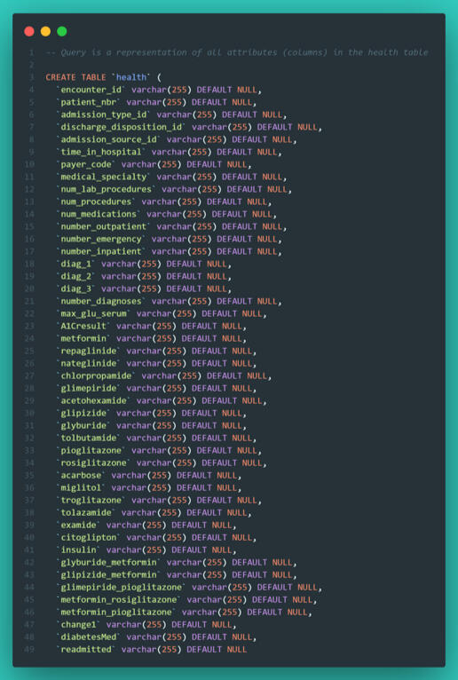
To get any meaningful insights, I knew I would need to combine these tables using aggregate functions, JOINs, and UNIONs to bridge the gap between patient attributes and their hospital visits.
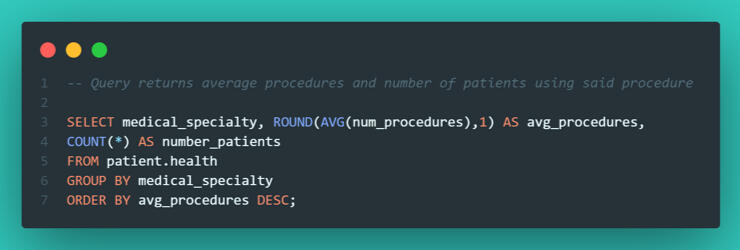
Phase 1: Data Quality & The "Average" Trap
My first task was to calculate the average number of procedures performed by each medical specialty. However, when I ran my initial query, the averages were returning as clean whole numbers rather than decimals.In data analysis, if something looks too perfect, it’s usually wrong. I added a patient count to the query to investigate.
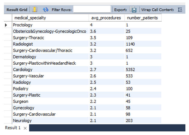
The issue became immediately clear. "Proctology" showed the highest average procedure count, but it only had one single patient. This is a classic data trap: outliers with insignificant sample sizes skewing the rankings.To fix this, I filtered the data to only include specialties with more than 50 patients and an average procedure count higher than 2.5.
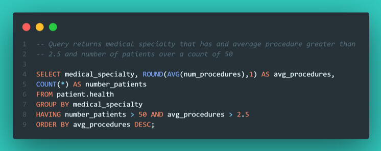
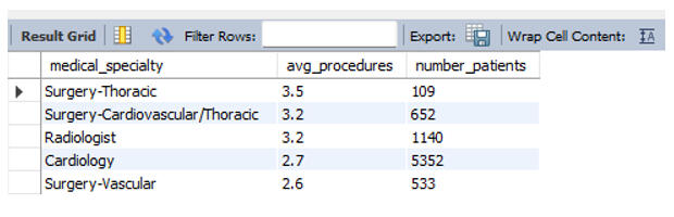
This gave me a much more accurate operational picture. Surgery–Thoracic emerged as the true leader in procedure volume among major departments.
Phase 2: Demographics and Procedure Volume
My next question was whether patient race correlated with the volume of lab procedures. To find this, I performed an INNER JOIN on the patient number key to link the Health and Demographic tables.
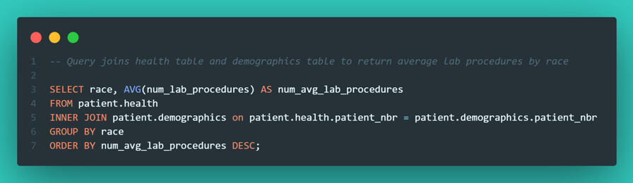
The data revealed that African American patients had the highest average (44 procedures), but the spread was tight. Every group sat above 40 procedures, suggesting that across these 130 hospitals, there was no meaningful statistical evidence of treatment disparity based on race.
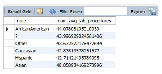
Phase 3: Correlation (Procedures vs. Length of Stay)
Does a higher volume of lab work equate to a longer hospital stay?. To analyze this, I didn't just want a raw scatter plot; I wanted to group the visits into "buckets" of workload: Few, Average, and Many procedures.I used a CASE statement to categorize the visits and then calculated the average length of stay for each bucket.
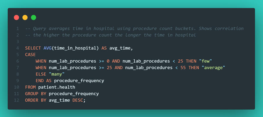
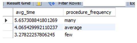
The correlation was undeniable: More procedures = longer hospital stays. While this seems obvious, quantifying it allows hospital administrators to predict bed occupancy rates based on the procedures ordered.
Phase 4: Visualizing Distribution in SQL
We often rely on tools like Tableau or PowerBI for visualization, but SQL is capable of quick checks too. I wanted to see the distribution of hospital stay lengths to check if most patients were staying fewer than 7 days.Using the RPAD function, I generated a text-based histogram directly in the query output.
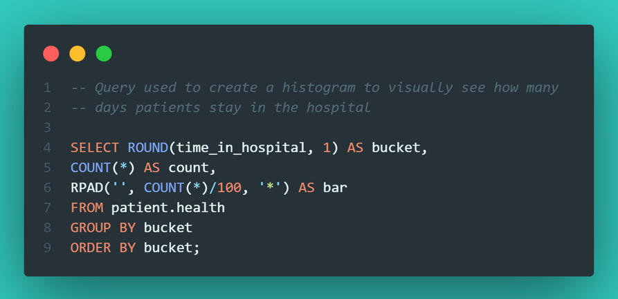
It’s not the prettiest chart in the world, but it was effective. It immediately confirmed that the vast majority of patients are discharged within 3 days.
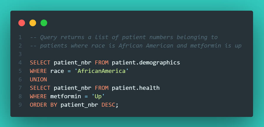
Phase 5: Advanced Filtering & Reporting
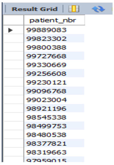
Finally, I needed to extract specific patient lists for the research department.Complex Filtering with UNION They requested a list of patients who were either African American OR had an "Up" status for Metformin (a diabetes medication). I used a UNION to stack these two distinct criteria into a single roster.
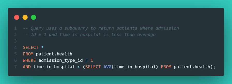
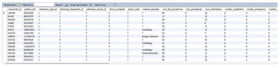
Identifying "True Successes" I also wanted to identify efficiency wins - specifically, patients admitted via the Emergency Department who were discharged faster than the hospital average. This required a subquery to first calculate the global average, and then filter the specific emergency visits against it.
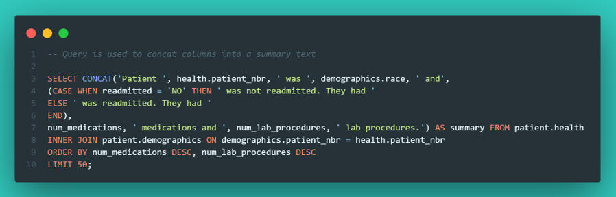
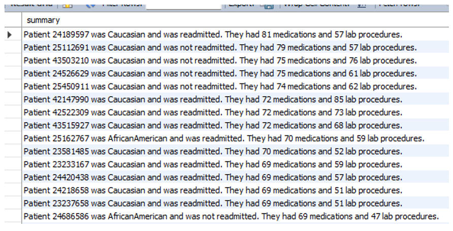
Automated Patient Summaries To wrap up the project, I used CONCAT to string together data points into human-readable sentences. This is useful for generating automated notes or simple reporting strings directly from the database.
Final Thoughts
This project was about more than just writing queries; it was about understanding hospital operations.1. Workflow bottlenecks: While Internal Medicine handles the volume, Thoracic Surgery is the most resource-intensive per patient.
2. Operational efficiencies: Since procedure volume is directly tied to length of stay, streamlining workflows in Thoracic and Cardiovascular departments would likely have the biggest impact on freeing up beds.
3. Data Integrity: The initial "Proctology" outlier served as a reminder that without context and proper filtering, data can easily mislead you.If you are looking for someone who can look past the code and understand the business logic behind the data, let’s connect.
Mining for Truth: How I Used Python to Uncover Quality Drivers in Manufacturing Data
When most people think about mining, they focus on the physical act - what comes out of the ground. But for me, the fascinating part has always been the process - how raw, messy inputs are transformed into something valuable.That’s why I chose to analyze this dataset on "Quality Prediction in a Mining Process". Even though the industry is different from my work at Veginova, the operational logic is identical: you have inputs, a transformation pipeline, and a measurable output.At Veginova, we know that quality isn't a guessing game; it comes from understanding the variables that matter and ignoring the noise. I used this project to test how well Python could cut through that noise and flag when a process goes off the rails.Here is how I broke it down.
Step 1: The Raw Material (Data Ingestion)
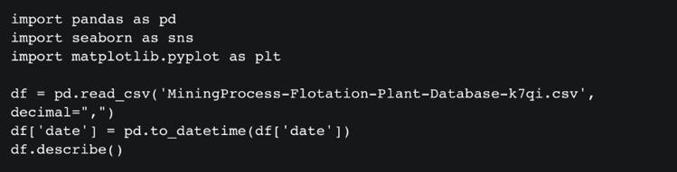
The dataset covers a period from March to September 2017 and is massive - over 737,000 rows across 24 columns. It includes granular metrics like flow rates, bubble heights, pH levels, and, crucially, the iron concentration percentage (our measure of quality).My first step was getting a statistical snapshot to understand the scale of the data and check for immediate red flags.
Step 2: Narrowing the Scope
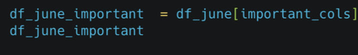
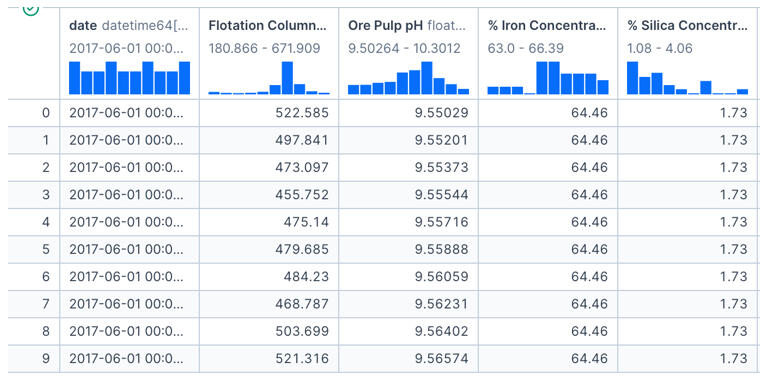
In any operation, trying to analyze every single variable at once causes "analysis paralysis." To get clear answers, I needed to isolate the metrics that theoretically impact quality the most.I filtered the data to focus on a specific window (June) and selected key columns: Flotation Levels, pH, Iron Concentrate, and Silica Concentrate.
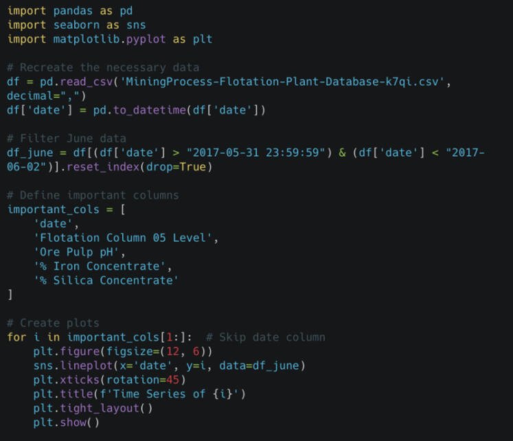
Step 3: Visualizing the Pulse of the Process
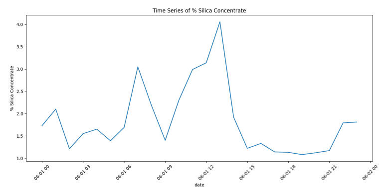
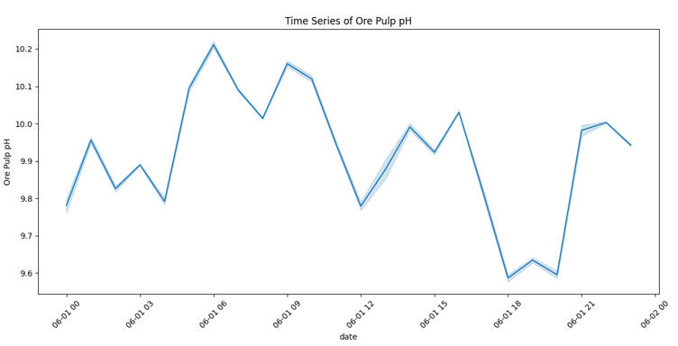
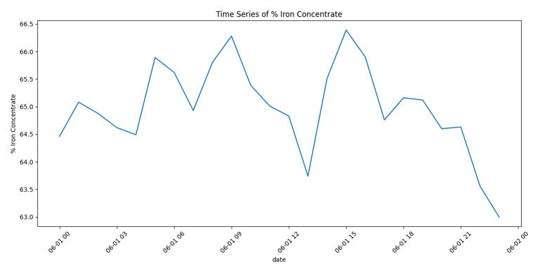
Once the data was prepped, I needed to see how quality was behaving over time. I plotted the Iron Concentrate to spot trends or instability.
The chart immediately revealed that iron purity fluctuates heavily with no obvious, stable pattern. To understand why, I wrote a script to visualize the other key process variables alongside the output.
By looking at these variables individually, I could start looking for cause and effect.
Step 4: The Detective Work (Finding Relationships)
Visually, the data was messy. This reminded me of a key lesson I’ve learned in my own work: you can't assume relationships just because they "should" exist. I needed to statistically prove which inputs were actually driving the output.I ran a Pairplot to visualize the relationships between every variable.

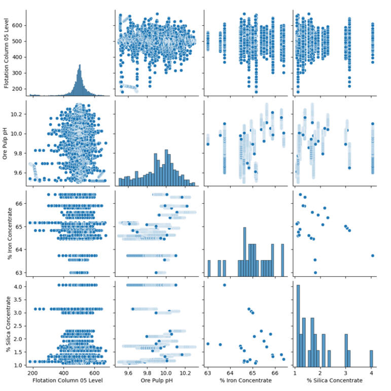
The results were surprising. Several variables that technically should have mattered (like flotation levels) showed almost no direct correlation with purity. This was a critical insight - it meant that tweaking those knobs might not actually improve the product.
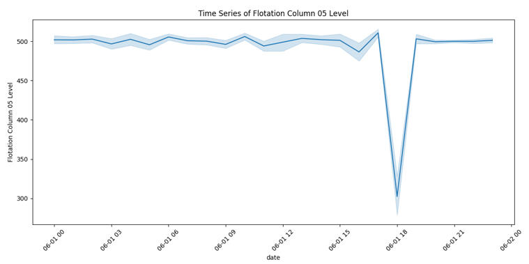
Step 5: The "Red Flag" Day
While analyzing the timelines, one specific date screamed for attention: June 1, 2017.

You can see a massive drop in the Flotation Level. This stands out as a clear anomaly where the process broke pattern. In a real-world scenario, this chart would be the starting point for a root-cause investigation to prevent future downtime.
Step 6: The Final Verdict
To wrap up the analysis, I created a Correlation Matrix Heatmap. This provides a mathematical score for how strongly variables are linked.

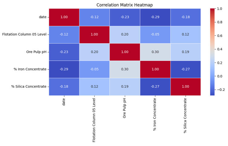
The heatmap confirmed the story. The strongest relationship (the dark red square) wasn't between an input and an output, but a trade-off between the two outputs: Iron and Silica.
Conclusion: Turning Data into Strategy
This project reinforced that real-world data is rarely clean. However, by visualizing the noise, we extracted actionable business insights:1. The Trade-off is Real: Improving Iron purity directly impacts Silica levels; they must be managed as a balance, not in isolation.
2. Don't Trust Assumptions: Variables we thought were important (like bubble height) had less impact than expected.
3. Watch the Anomalies: June 1st showed how a single bad day can skew the data, highlighting the need for real-time monitoring.If you or your team need someone who can break down operational data, look past the noise, and find the insights that actually improve performance, I’d love to connect.
Project Spotlight: TomatoIntel – Automating Market Intelligence with Python & AI
In the fast-paced world of Ag-Tech, staying ahead isn't just about growing better crops - it's about knowing exactly what the market is doing before your competitors do.I built TomatoIntel to solve a specific problem: Agricultural research is often slow, manual, and reactive. I wanted to create a system that doesn't just wait for data but actively goes out, finds it, and turns it into strategy.Here is how I built a "Single Source of Truth" for agricultural market intelligence.
The Dashboard
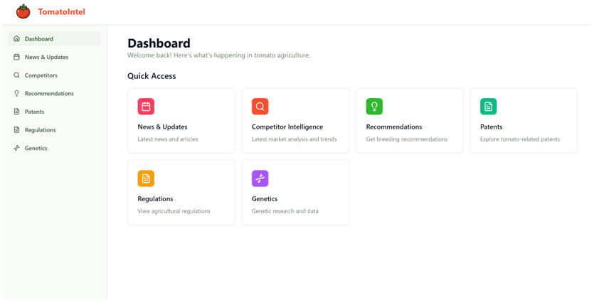
The main interface providing quick access to News, Competitor Intelligence, Recommendations, and Patents.
The Problem: Why Market Signals are Easy to Miss
Market changes in agriculture are rarely loud. A subtle regulation update or a new competitor patent can shift the entire industry.Traditionally, analysts spend hours manually checking websites, scanning government portals, and reviewing patents. By the time this data makes it into a report, the competitive advantage is often already lost.I built this system to replace that manual monitoring with automated intelligence.
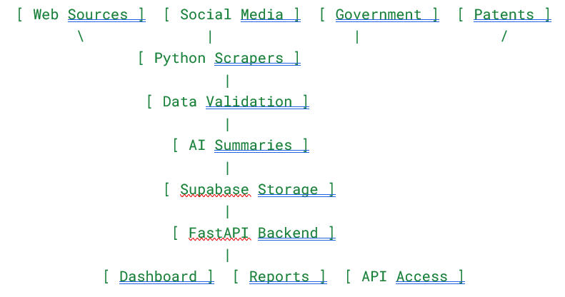
How It Works: The Intelligence Pipeline
The core of this project is a Python-powered pipeline that turns chaos into clarity. It works in four distinct stages:1. Automated Collection: I used Python scrapers (utilizing tools like Crawl4AI, Apify, and Selenium) to crawl competitor sites, patent databases, and even social media platforms like LinkedIn and Twitter.2. AI Processing: Raw data is messy. I integrated AI models (GPT-4) to validate, clean, and summarize the data. This step identifies themes and categorizes topics automatically.3. Storage & Backend: The processed insights are stored in Supabase and served through a robust FastAPI backend.4. The Output: Users get a clean, structured dashboard that highlights the most impactful changes.
System Architecture
Market changes in agriculture are rarely loud. A subtle regulation update or a new competitor patent can shift the entire industry.Traditionally, analysts spend hours manually checking websites, scanning government portals, and reviewing patents. By the time this data makes it into a report, the competitive advantage is often already lost.I built this system to replace that manual monitoring with automated intelligence.
Real-World Application
So, what does this look like in practice?Imagine a breeding manager logging in. Instead of sifting through Google Search results, they immediately see that a competitor has launched a disease-resistant variety in a new region, or that a new regulation is affecting export approvals .Because the system operates autonomously , the manager can make proactive adjustments to their breeding strategy instead of reacting late.
Conclusion: What This Project Represents
This dashboard is more than just a web app; it is a complete intelligence system. It demonstrates my ability to merge several complex technical domains:Data Engineering: Building automated pipelines that ingest data from multiple disparate sources.AI Integration: Moving beyond basic scripts to use AI for insight generation and summarization.Full-Stack Development: From the Supabase database to the FastAPI backend.
Future Improvements
I am currently looking at enhancing the system by integrating forecasting models and regional scoring. The goal is to evolve the platform from reporting on what has happened to predicting what will happen.
Beyond the Dashboard: Unlocking Supply Chain Secrets with Power BI
When I first got my hands on a dataset from DataCo Global, the goal wasn’t academic - it was operational. With over 180,000 rows covering everything from customer details to shipment timings, this wasn't a clean, tutorial-style sample. It was real, messy operational data.My objective was straightforward: treat the business like a supply-chain system, map the inputs, and figure out where the process performs well - and where it breaks down. Specifically, I needed to answer two critical questions:
1. Which products actually drive profit?2. Where does the delivery process fail?
The Profit Paradox: Volume vs. Efficiency
One of the most interesting takeaways from this analysis was how different the story looks depending on how you measure success.When looking at the Sum of Benefit (Total Profit), "Fishing" products dominated the chart. Because the company sells a massive volume of these items, they naturally look like the revenue drivers. If you stopped the analysis here, you’d think Fishing was the crown jewel of the catalog.
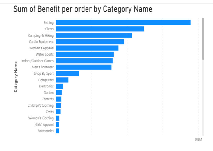
But I decided to flip the metric to Average Benefit per Order, and the rankings changed completely. Suddenly, "Computers" jumped to the top spot by a wide margin, while Fishing dropped to fifth place.
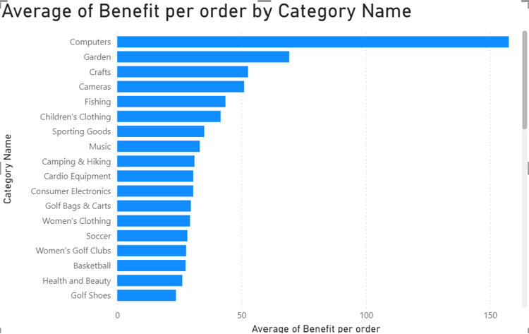
The Insight: Fishing brings in the cash flow through sheer volume, but Computers are the efficiency kings, delivering the highest profit per individual transaction. For a business strategy, this distinction is vital - you market fishing gear for volume, but you sell computers for margin.
The 4-Day Tipping Point
Profit is only half the battle; you have to get the product to the customer. When analyzing delivery performance, I looked for the specific conditions that push an order into "late" territory.
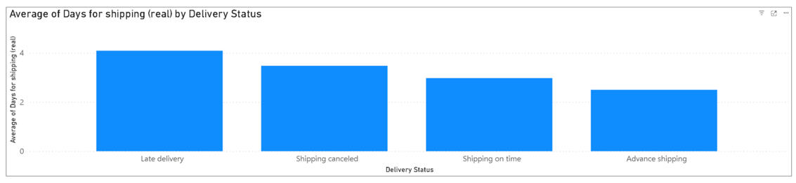
The data revealed a sharp cutoff: once shipping time passes the four-day mark, the order is statistically likely to be late. This gives the operations team a clear KPI: to ensure customer satisfaction, logistics need to land shipments within three days or less.
Locating the Bottlenecks
I also broke down delivery performance by region to see where these delays were clustering.
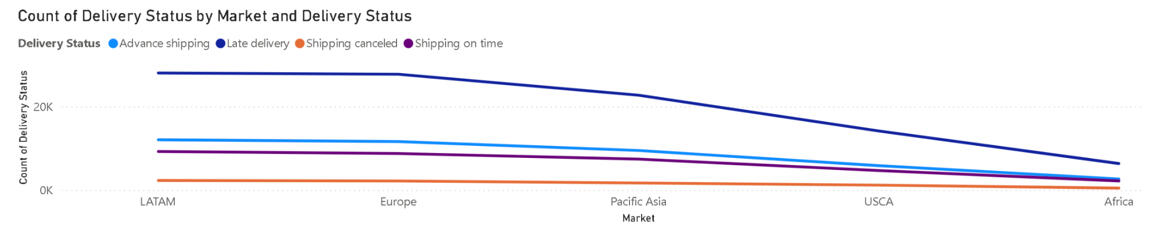
The visualization was stark:
Latin America and Europe experienced the most late deliveries (over 27,000 each).In comparison, the US and Canada had roughly half that amount.
This suggests that the "delivery problem" isn't a global issue - it is a specific regional logistics failure that needs targeted investigation.
Why This Matters
This project reinforced a core philosophy I bring to my data work: processes rarely behave in clean, linear ways.It’s easy to assume patterns will be obvious, but real operational details often contradict assumptions. By using Power BI to visualize these trends, I was able to move beyond simple reporting and provide actionable insights - like the need to review carriers in LATAM or the strategic difference between the fishing and computer categories.
The Growth Autopilot: How I Build Systems That Scrape, Write, and Sell While I Sleep
We all know the drill: Growth requires consistency. You need to find leads, create content, and send outreach. But doing that manually? It’s a recipe for burnout.I don’t believe in grinding harder; I believe in building smarter systems.In this portfolio breakdown, I want to show you three specific AI agents I’ve built that automate the entire lifecycle of a business—from finding the customer to closing the deal.
1. The Intelligence Agent: Turning Messy Data into Gold
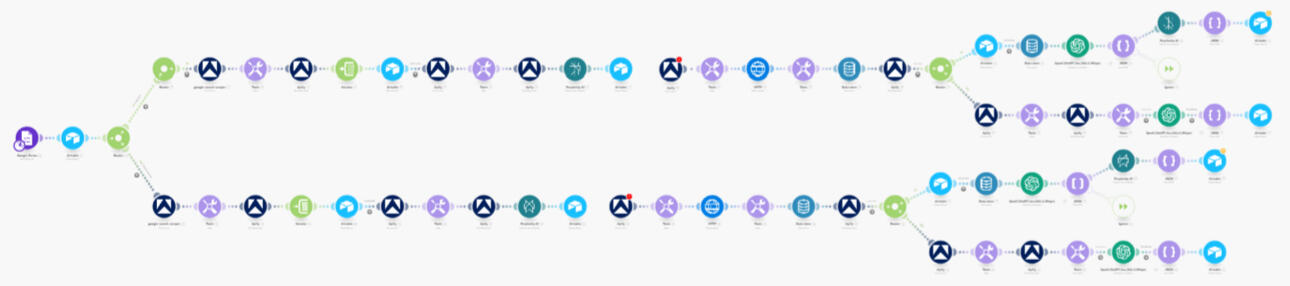
The first step in any campaign is research. Usually, this involves hours of clicking through LinkedIn profiles and copy-pasting data into spreadsheets. I built a LinkedIn Scraper & Market Intelligence Agent to eliminate that work entirely.
How it works
This system doesn't just scrape names; it acts like a research analyst. It pulls data from LinkedIn and the wider web, but the real magic happens in the enrichment phase.I use Perplexity and LLMs to analyze the intent of the company. It summarizes what they do, detects if they are actually ready to buy, and assigns a lead score (0–100). If the lead is low quality, the system ignores it. If it’s high quality, it gets stored in a structured database, ready for action.
Here is the full architecture of the system:
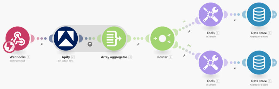
The Impact:
No more manual research: It replaces hours of drudgery.Better Data: We get high-context, scored leads, not just raw lists.Flexibility: I can point this at any niche or industry just by swapping the inputs.
2. The Content Engine: Infinite Ideas, Zero Writer’s Block
Consistency on LinkedIn is crucial, but staring at a blank page is painful. I built the AI-Powered Content Creator to automate the creative pipeline - from idea to published post.
How it works
This isn't just ChatGPT writing generic fluff. The system pulls ideas from my Airtable and runs them through specific copywriting frameworks (like PAS, IIR, and SIA) using Gemini and Perplexity.It generates captions, hooks, and even creates matching visuals automatically using ImageKit. Once the content is ready, the agent posts it directly to LinkedIn without me ever opening a browser tab.
Here is the "Brain" of the operation:
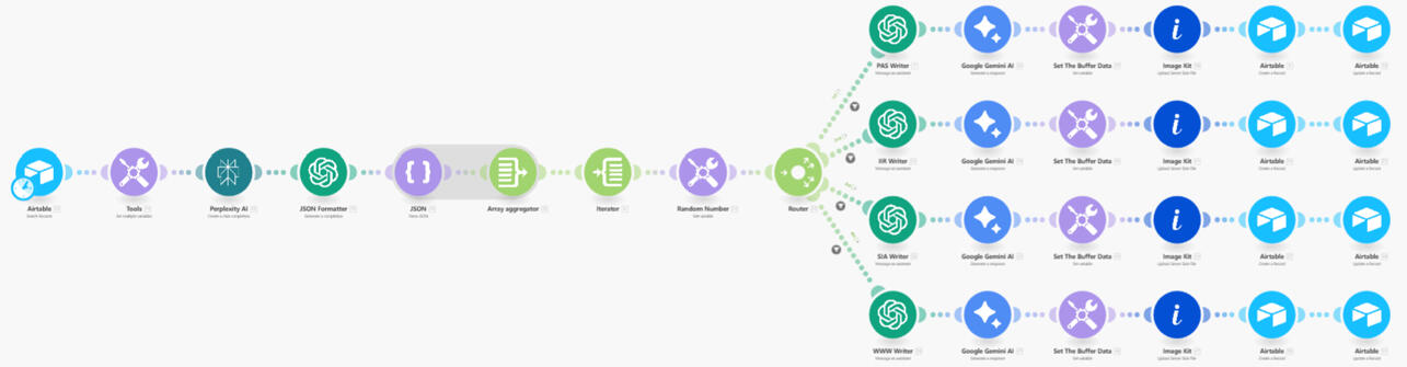
Here is the Publishing mechanism:

The Impact:Zero manual writing: It turns content into a system, not a daily task.Visuals included: No need to open Canva; the graphics are generated automatically.Scalability: This can manage multiple accounts or creators simultaneously.
3. The Closer: Hyper-Personalized Outreach at Scale
Now that we have leads and content, we need to start conversations. This is the Automated Outreach System. It connects the dots between scraping, research, and CRM.
How it works
This is the most advanced piece of the puzzle. It scrapes prospects using Apify, but then it uses Clay to perform deep enrichment. It figures out the company's exact positioning, key pains, and opportunities.Then, it uses Claude to write 1-to-1 personalized emails and LinkedIn DMs based on that specific research. Finally, it pushes those messages into Smartlead (for email) and Expandi (for LinkedIn), while updating the GoHighLevel CRM.
Here is the data collection and enrichment flow:

Here is the trigger mechanism:

Here is the outreach generation flow:

The Impact:Instant Deployment: Campaigns go live the moment leads are found.CRM Sync: GoHighLevel is always up to date with the pipeline stage and contact info.Personalization: Every message feels hand-written because it is based on deep data analysis.
The Bottom Line
At the end of the day, these automations aren't just about saving time; they are about focus.By leveraging tools like Make.com, Apify, and the latest LLMs, I’ve built a system that handles the repetitive "grunt work" of business growth. This allows us to stop worrying about whether the leads were scraped or if the post went live, and start focusing on what actually moves the needle: strategy, relationships, and closing deals.The technology is complex, but the result is simple: A business that runs on autopilot.If you are ready to stop grinding manually and start building a machine that works for you, I’d love to help you build it. Let’s turn your workflow into your competitive advantage.
Let’s Build Your System
These aren't just "bots"; they are comprehensive workflows that handle the heavy lifting of growing a business. Whether it's market intelligence, content production, or sales outreach, I build systems that allow you to focus on strategy while the AI handles the execution.
Interested in automating your growth stack? Let’s connect.