Archived analysis work. My current focus is here: rasmuskampmann.com.
Funnel & Segment Analysis
Funnel decomposition and firmographic segment-lift analysis across 102,007 records. One employee band converted at 37.5%, everyone else at 3.0%. The drop was after the first conversation, not before it. Synthetic data, real method.
Only 12.8% of held meetings converted, so the funnel dropped after the first conversation, not before it. The deliverable is an additive scoring rule built from the segment lift.
Built in Power BI, SQL, and Python. Validated in DuckDB. Reproducible from a seeded synthetic generator.
A funnel decomposition across 102,007 records located where conversion actually broke down, then a firmographic segment-lift analysis identified who converted and who did not. The headline volume looked fine; below it, only 12.8% of held meetings converted, and one band, companies with 6 to 20 employees, converted at 37.5% while everyone else sat at 3.0%. The question was where conversion broke down, which segments converted once they reached a real conversation, and what scoring rule that lift implied.
The figures are synthetic, generated from a seeded model that reproduces the shape of a real CRM and auto-dialer engagement whose data cannot be published. The method is the point.
Schema, scorecard rule, and Power BI model on GitHub.
The business question
The sales lead decides which companies go on the dial list each quarter. The team was judging the outbound operation on calls made and meetings booked, top-of-funnel measures, and the default response to thin results was to dial more.
The question I had to answer: across the whole funnel, where is the conversion actually breaking down, which company segments convert once they reach a real conversation, and what decision rule should gate the dial list. The output had to be something the lead could act on without a data team in the room, a dial-or-skip rule they could defend to their VP and re-fit themselves each quarter. That requirement is why the output is a scorecard rule, not a regression, and why the analysis had to follow the funnel past the booked meeting.
Where the data came from
The original engagement ran on a private export from a CRM and an auto-dialer at a Danish SMB accounting firm: call logs, the meetings they booked, the deals those meetings became. That export cannot be published, so this version runs on a seeded synthetic generator that produces nine CSVs with the same schema and shape. Same script, same data on every run. The process from this point is the real one, applied to the stand-in.
The grain matches how the source systems store the data: one row per call attempt, one per booked meeting, one per deal. Three things had to be derived from the raw export. First, which call connected and which booked a meeting. Second, whether a booked meeting was actually held or cancelled. Third, the held-to-won outcome joined back to the company’s firmographics. The held-versus-cancelled column is what changed the analysis from a top-of-funnel story to a conversation-conversion one.
The data model
I modeled the data as a star schema, with the funnel as three fact grains, one per stage I needed to cut:
fact_calls: one row per dial (102,007), carrying connect and meeting-booked flags. The top of the funnel.fact_meetings: one row per booked meeting, carrying held-or-cancelled status and the days-to-close clock. The middle of the funnel.fact_deals: one row per deal, carrying won/lost and MRR. The bottom.
Seven conformed dimensions sit on those facts: date, company, rep, stage, lost reason, source, and the firmographic attributes on the company. I put the firmographic attributes (employee band, industry) on the company dimension rather than on the deal record, so every funnel step could cut by segment without rewriting a query. Relationships are single-direction. The won-date and lost-date relationships are inactive by default and only activated through USERELATIONSHIP where a specific timing measure needs them, so no measure can pull the wrong date by accident.
Cleaning and validation
Every conclusion in this analysis depends on attributing each held meeting to one company segment and on the held-versus-cancelled split being right. Three things had to be true before I drew any chart, and most volume reports skip all three.
A held meeting counted as cancelled, or the reverse, would have moved the entire conversion-step finding. I reconciled the meeting status against the deal outcome, so a “held” meeting with no corresponding deal record could not quietly inflate the held count. The cancellation share (43.0% of all losses) was cross-checked against the loss-reason mix rather than assumed from the meetings table alone.
A deal with more than one meeting must count once, not once per meeting, or any segment that books more meetings per deal would appear to convert better than it does. I kept the meeting and deal streams at their own grain and rolled them up on the deal key before joining, so revenue and win counts are counted once per deal.
The last check catches the kind of error that does not surface in a single review. I wrote one verification script that recomputes every figure in this write-up and the dashboard directly from the CSVs. Then I cross-checked the Power BI measures against the same script, definition by definition. The headline measures reproduce exactly: meeting-to-won 12.8%, the 6-20 band 37.5%, MRR won $278,449. The scorecard band coverage, its share of the dial-list universe and of historic wins, comes from applying the documented scoring rule to those same tables, not from the analysis script. If any of these numbers changes, the script fails before the chart ships.
The approach
I worked at the held-meeting grain, not the dial grain. A call that never reaches a conversation does not tell you anything about who converts, only that someone picked up. A held meeting does. I cut every held meeting by the company that received it and read the funnel one step at a time, so any drop in conversion would surface at the step it actually happened.
Three cuts produced the analysis. The funnel waterfall located which step lost the most conversion. The segment cuts, employee band and industry, identified which company segments converted at the held-meeting step and which did not. The loss mix accounted for the deals that did not close at all. Each cut produced one chart with one finding. Cuts that showed no signal are reported as no signal rather than dressed up, because a flat result is a finding too.
The findings
The first cut was the full funnel waterfall, to see which step actually loses the most conversion.
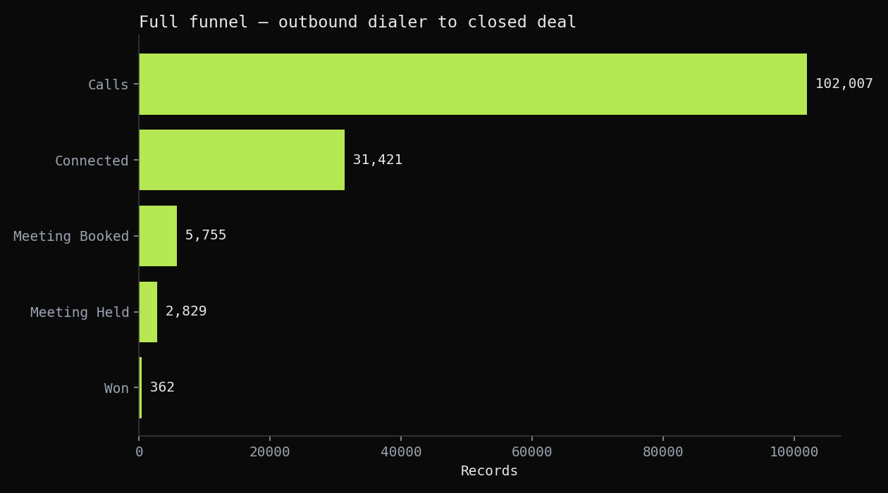 102,007 calls, 31,421 connected, 5,755 meetings booked, 2,829 held, 362 won. Each step loses volume in expected proportions until the final one, where only 12.8% of held meetings become wins. The conversion drop the team had not been measuring was the one after the meeting, not before it.
The waterfall makes the case for not buying more dials. Connect-to-booked behaves like a normal outbound funnel. The drop is at meeting-to-won: 2,829 conversations produced 362 deals. Adding top-of-funnel volume scales the 12.8%, it does not change it. The next cut tested whether the meeting-to-won step varies by company segment, or whether the 12.8% is roughly the same everywhere.
The second cut was held-to-won by company employee band, to see whether the 12.8% conversion was concentrated in any specific segment.
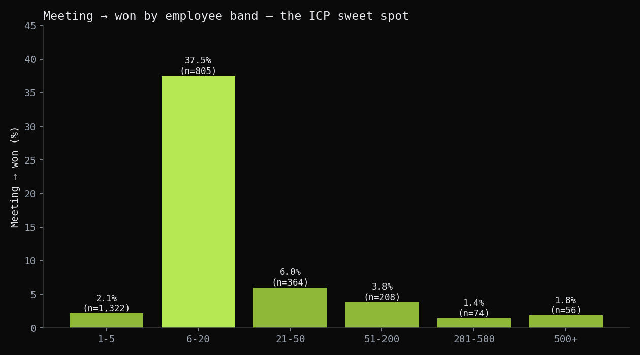 Held-to-won by company employee band. The 6-to-20 band closes at 37.5% on 805 held meetings. Every other band sits between 1.4% and 6.0%. The conversion rate is concentrated in one segment rather than rising or falling smoothly across the bands.
This is the strongest signal in the analysis. Conversion is not distributed across company sizes, it concentrates in one band. The 6-to-20 segment closes at 37.5%, everything else combined closes at 3.0%, a 12.7x split. A dial list that ignores employee band spends most of its calls outside the only segment that converts, and the blended 12.8% baseline obscures the structure entirely.
The third cut was held-to-won by industry, to test whether any industries either over-converted or failed to convert at all.
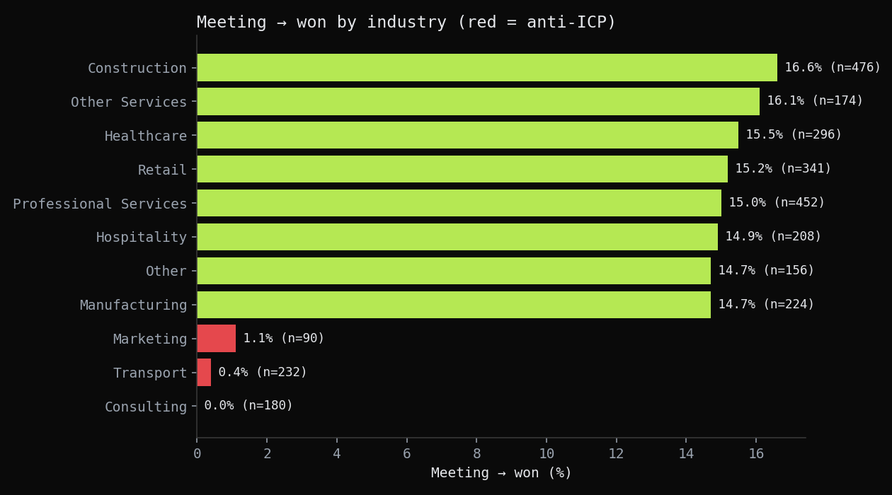 Held-to-won by industry. Consulting, Transport, and Marketing close at roughly zero: two wins on 502 held meetings combined. Every qualifying industry sits between 14.7% and 16.6%.
Industry does not rank prospects on a curve, it disqualifies three of them outright. Consulting (0.0%), Transport (0.4%), and Marketing (1.1%) are not weak-converting industries, they are non-fit at the level the data can detect: 502 held meetings, two wins. The qualifying industries sit flat at around 15%, which means industry functions as an exclusion list, not a scored input. Two fields, employee band and an industry exclusion, do almost all the discriminating work, which is what made the final deliverable a rule rather than a regression.
The fourth cut was held-to-won by accounting software, which returned no signal.
The same cut by accounting software came back flat: every system between 12.1% and 13.4%, sitting on the 12.8% baseline. I could have presented a “best-converting accounting system” chart by picking a top and bottom, but the honest reading is that the variation is noise, so the cut does not earn a chart. Reporting the null keeps the two real signals credible.
The fifth cut was the loss-reason mix, to account for the deals that did not close and explain the rest of the funnel drop.
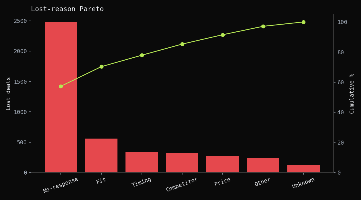 Loss mix. 43.0% of all losses are meeting cancellations, and No-response is 57.3% of the categorised reasons. Most lost deals were lost before a salesperson ever spoke to them.
There is a second loss mechanism alongside the conversion gap. Of 4,329 losses, 1,862 (43.0%) are meeting cancellations, deals that ended between the booking and the conversation itself. That is a meeting-confirmation problem, not a sales-skill problem, and it is fixable without touching the dial list. It also accounts for why top-of-funnel volume felt unproductive: a large share of booked meetings never became conversations at all.
The final cut was the held-to-won cycle, to rule out the possibility that long sales cycles were masking the real conversion problem.
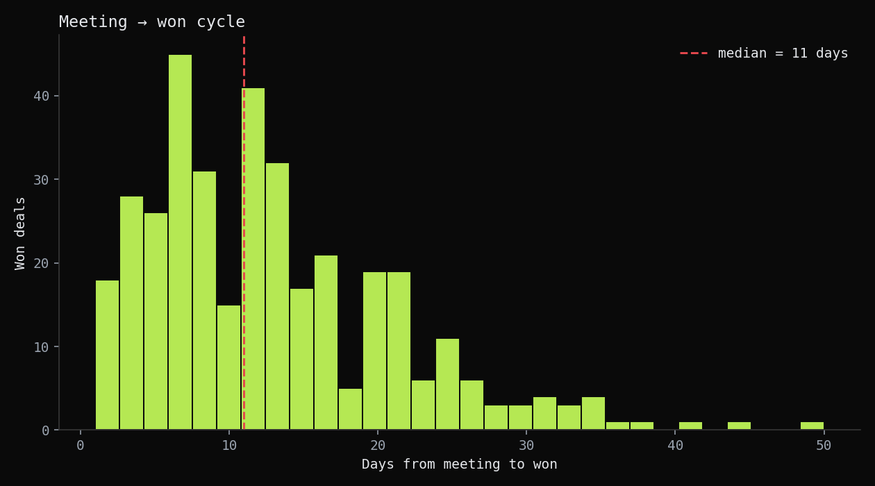 Days from held meeting to won. Median 11 days, 90th percentile 24 days. Deals that close, close within a month.
The cycle is short: median 11 days, 90th percentile 24. Deals that close do not drag on. Cycle time is not where to focus improvement effort, the segment cuts already identified where the conversion lift sits. The cycle chart is reported here to rule out a slow-deal explanation for the 12.8% baseline, not to argue for cycle-speed as a lever.
The deliverable
The findings combine into one additive lead score that gates the dial list. Each company earns points on the two fields that carried signal, employee band and industry, and the total decides dial or skip.
- Employee band 6-20: the dominant positive weight. This is the segment split the second cut found.
- Excluded industries (Consulting, Transport, Marketing): a hard negative that zeros the score regardless of company size.
- Everything else: small or zero weight, because no other field in the dataset showed signal.
There is no “maybe” tier. The data showed one decisive split rather than a smooth curve, so the scorecard has two outcomes, not three. On the historic data the Dial band covers 22.7% of the company list and 83% of the wins: skip three-quarters of the list, keep most of the revenue. I built the scorecard so the sales lead can re-fit the weights each quarter from the same tables and defend every point of the score to a VP from the underlying segment lift, not from a model coefficient. On the original engagement the scorecard gated the next quarter’s dial list; the portfolio version reproduces the rule, the bands, and the coverage from the same tables.
What the sales team does with this:
- Score every company on employee band and industry; only dial the 6-20 band.
- Drop Consulting, Transport, and Marketing from active dial lists.
- Add a meeting-confirmation step to recover the deals lost to the 43% cancellation rate.
- Re-fit the score each quarter from the same tables.
What I’d do differently
The first pass read this as a top-of-funnel problem because that is what the team measured and what the call volume invited. The funnel waterfall is what reframed it: the conversion drop was the meeting-to-won step the whole time, and no amount of connect-rate optimisation touches it. I should have drawn the full funnel before looking at any single step, because the step everyone watches is rarely the step that loses the most conversion.
The non-fit industries are an exact zero on this synthetic population, which is cleaner than reality. A real engagement would show a low but non-zero rate there, and the honest call would be to set the exclusion threshold from a confidence interval on the real conversion rate, not from an exact zero. The method is the same; the threshold would need a real sample behind it.
Tools, by step
The same tools most analysts list, used at a specific step for a specific reason:
| Step | Tool | What it did here |
|---|---|---|
| Sourcing | CRM + auto-dialer export (synthetic stand-in via a seeded Python generator) | Call logs, meetings, and deals at system grain; no private data leaves the original engagement |
| Modelling | SQL (Postgres-style DDL) | The star schema: three funnel fact grains, seven conformed dimensions, company as the segment axis |
| Cleaning and validation | DuckDB | Held-vs-cancelled reconciliation, grain dedupe on the deal key, query validation before any finding |
| Analysis | Python (pandas, numpy) | The funnel waterfall, segment cuts on employee band and industry, the loss mix, and a verification script that recomputes every quoted number |
| Dashboard | Power BI (PBIP/TMDL, validated headless with pbi-cli) | The funnel and the scorecard as something the sales lead reruns each quarter |
| Reproduction | One seeded script | The whole pipeline regenerates identically from source on every run, with no real client data |
Every chart in this case study is a bar, a line, or a histogram. One comparison type. No chart requires a second visual encoding to interpret.
Want the technical deep-dive? Full code, queries, and reproducible analysis live on GitHub.
View on GitHub →