Archived analysis work. My current focus is here: rasmuskampmann.com.
Channel & Churn Analysis
Multi-factor scoring and twelve-month survival analysis across ten channels reported as one blended mix. Scored on win rate, capacity, speed, and churn. Synthetic data, real method.
The largest channel by volume won 8.6% of the time, consumed 91% of all sales-rep dialer hours, and churned half its customers within twelve months. The scorecard handled the split with a rule, not a model, so the revenue-ops lead could re-run it each quarter without a data team in the room.
Built in Power BI, SQL, and Python. Validated in DuckDB. Reproducible from a seeded synthetic generator.
Ten acquisition channels were being reported as one blended win rate. A multi-factor analysis scored each channel on four axes, win rate, capacity consumed, time-to-won, and churn, and a twelve-month survival analysis tracked how much of each channel’s revenue actually lasted. The blend hid the structure: win rates ran from 4.5% to 79%, twelve-month churn from 4% to 50%, time-to-won from a week to a month. The deliverable is a scorecard rule that re-runs each quarter from the same tables.
The figures are synthetic, generated from a seeded model that reproduces the shape of a real CRM engagement whose data cannot be published. The method is the point.
Schema, scorecard rule, and Power BI model on GitHub.
The business question
The revenue-operations lead decides every quarter where sales-rep capacity goes: which channels to invest hours in, which to leave alone. They were making that call from a single blended win rate that flattened the real differences between channels.
The question I had to answer: across ten channels, which return retained revenue per auto-dialer hour, which return revenue that leaves within twelve months, and which absorb dialer hours without returning either. The output had to be something the lead could act on without a data team in the room, a ranking they could defend to a CFO and re-run themselves each quarter. That requirement is why the output is a scorecard rule, not a model, and why churn had to be measured alongside win rate.
Where the data came from
The original engagement ran on a private CRM export from a Danish SMB accounting firm: deals, the activities that created them, the meetings they generated. That export cannot be published, so this version runs on a seeded synthetic generator that produces ten CSVs with the same schema and shape. Same script, same data on every run. The process from this point is the real one, applied to the stand-in.
The grain matches how the CRM stores the data: one row per deal, with separate streams for the touches that created it and the meetings it generated. Three things had to be derived from the raw export. First, the channel attributed to each deal, using first-touch attribution. Second, the sales-rep dialer hours consumed per deal. Third, the post-won lifecycle: whether the customer was still active at twelve months, and if not, when they left. The post-won column did not exist in the original reporting. Adding it is what shifted the conclusion.
The data model
I modeled the data as a star schema with channel as the primary dimension and three fact grains, one per stage of the funnel I needed to cut:
fact_deals: one row per deal, channel-attributed, carrying the close outcome, the dialer hours spent on it, and the post-won columns (is_churned,retained_months,churned_mrr).fact_touches: one row per acquisition touch, used for first-touch attribution and the dialer-hour rollup.fact_meetings: one row per booked meeting, used for the show-rate and cancellation cuts.
Seven conformed dimensions sit on the facts: date, channel, campaign, company, rep, stage, lost reason. I made channel a dimension rather than a column on the deal so that every measure could cut by channel without rewriting a query. Relationships are single-direction, one row per deal. I left dim_campaign unjoined to dim_channel on purpose, because channel context already arrives through fact_deals, so joining them would have snowflaked the schema without adding anything. The decision matters because the analyst who inherits this model needs to extend it, not rebuild it.
Cleaning and validation
Every conclusion in this analysis depends on attributing each deal to one channel. Three things had to be true before I drew any chart, and most reports skip all three.
A broken channel key would have quietly dropped deals from a rollup, which would have biased the ranking toward whichever channel kept its keys clean. I joined every foreign key in the fact tables back to its dimension in DuckDB and required zero orphans, including the post-won churn_date_key. The check came back clean. If it had not, the win-rate split could have been a data-quality issue rather than a real one.
A deal with three meetings must count as one deal, not three, or any channel that books more meetings would appear to win more revenue than it actually does. I kept the touch and meeting streams at their own grain and rolled them up before joining to the deal grain. That way revenue gets counted once per deal, and the dialer-hour rollup is not inflated by channels that schedule more meetings per deal than others.
The last check catches the kind of error that does not show up in a single review: the scorecard quotes a number, and the rule that produces the band has to agree with it. I wrote one verification script that recomputes every figure in this write-up, the dashboard, and the scorecard directly from the CSVs, and then reassigns the bands using the same rule. If any measure changes, the script fails before the chart can ship.
The approach
I worked at the channel grain because the decision the analysis served was a per-channel one. Every deal got cut by the channel that acquired it, and each channel got scored on four measures. No single measure was enough on its own to rank a channel, so the score combines them.
Win rate. The base measure: deals won as a share of held meetings. A channel that wins often can still lose money if those customers leave, so this only tells half the story.
Sales-rep capacity. Won revenue returned per auto-dialer hour. Only the two outbound dialer channels consume auto-dialer hours; the other channels still hold meetings, but they do not run through the dialer, so the analysis tracks the dialer as the scarce resource it actually competes for. That asymmetry is one of the central findings the scorecard depends on.
Time-to-won. Days from first touch to closed-won. A channel that closes in a week frees a rep’s capacity that a channel taking a month does not, which compounds over a quarter.
Churn. The post-sale measure I added in the second pass. Twelve-month retention by acquiring channel, and net revenue retention layered on top to catch contract expansions and contractions. Without this measure, the analysis would have ranked channels on win rate alone, which is the same blended view the original reporting already had.
Two things sat outside the scorecard on purpose. Financial cost by channel, paid media spend, content production, partner commissions, was on a separate ledger the marketing team owned, not a sales-ops input. And cross-sell and upsell are expansion motions on existing customers rather than new-customer acquisition. I included them in the scorecard because the sales team’s quarterly capacity decision treated all motions as competing for the same SDR and AE hours. A pure-acquisition analysis would split them out.
The four measures combine into one additive score that drops each channel into one of four bands: scale, maintain, cap, kill. I built the score as a rule rather than a model on purpose. A regression would have been more precise and unusable, because the revenue-ops lead could not have audited it or rebuilt it next quarter. Every point in this rule traces back to a number in the dimensional tables, so the lead can defend any band assignment by pointing at the underlying measures.
The findings
I started with win rate by channel, because that’s the measure the original reporting blended. The cut showed two clusters with nothing between them.
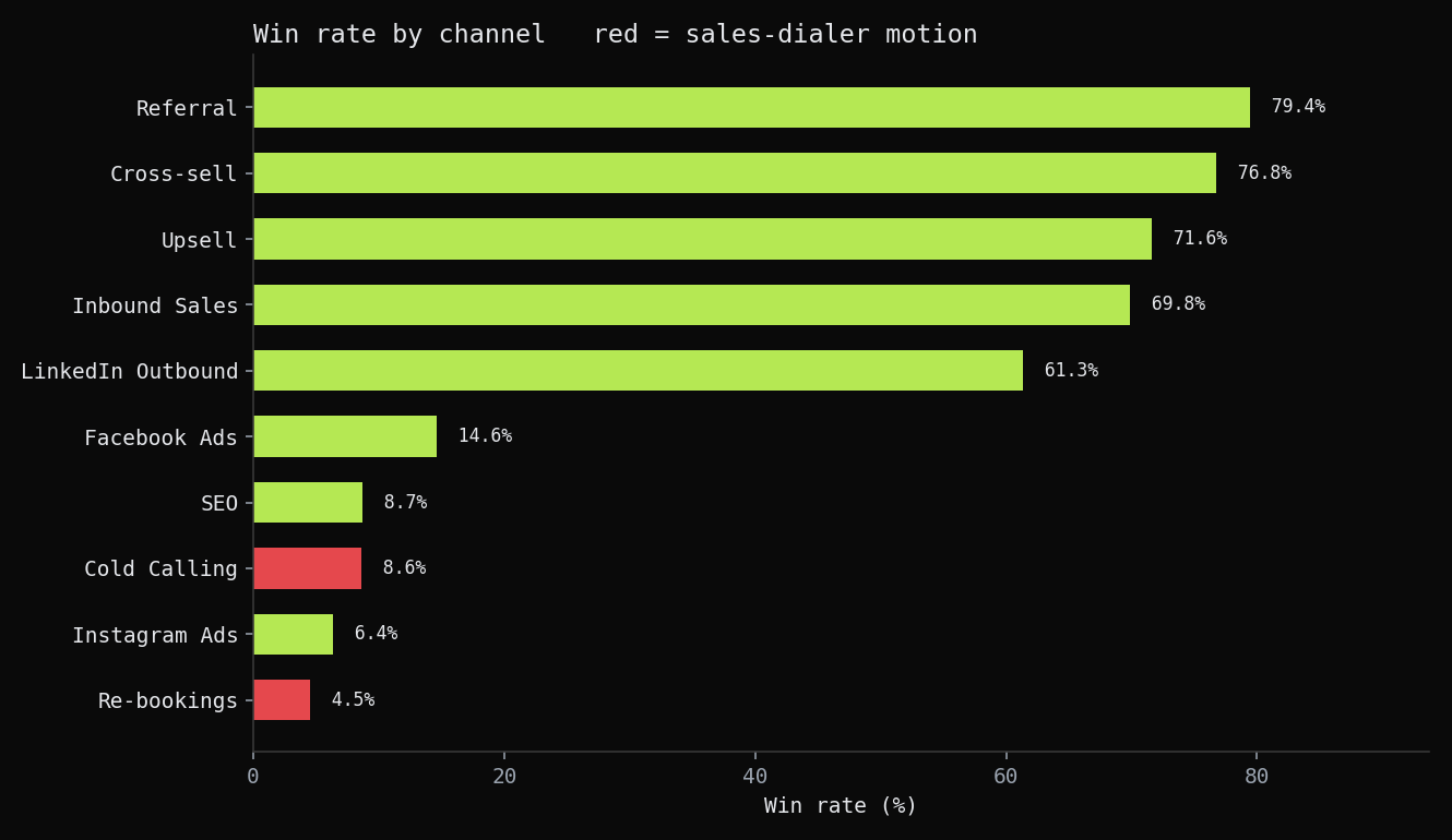 Win rate per channel, sorted, with outbound dialer channels marked in red. Five channels (referral, cross-sell, upsell, inbound, LinkedIn) sit above 61%. Five sit below 15%. Nothing falls between. Cold calling, which books the most deals of any channel, sits at 8.6%.
Once the channels are split out, the case for abandoning the blend is in one chart. The channels do not sit on a smooth curve from good to bad. They form two clusters with nothing between them. Averaging across them describes neither cluster. Cold calling at 8.6% is not slightly below the blended mean. It is in the bottom cluster, and it is the largest channel the team runs by deal volume.
Next I cut by deal volume per channel, to see whether the team was investing time in proportion to channel quality.
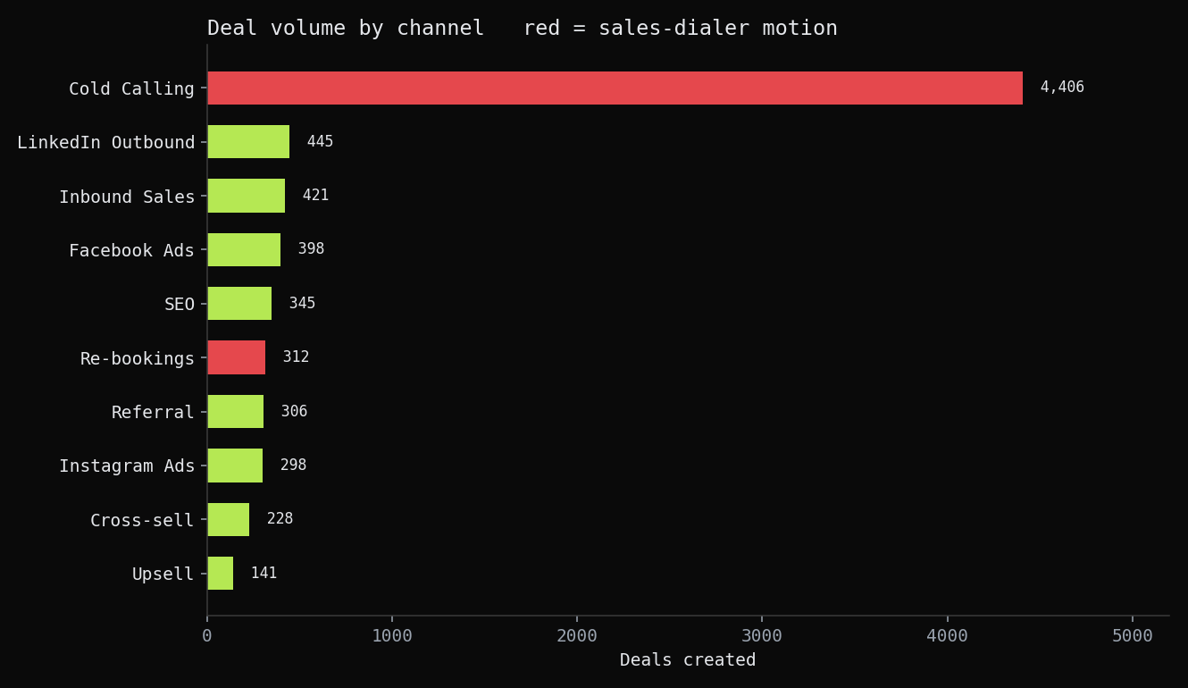 Deals created per channel. Cold calling is roughly ten times the next-biggest channel. The single bar that dominates the volume chart is the same channel sitting third from the bottom on win rate.
The channel with the most deals has nearly the worst win rate. The team’s capacity was being spent in proportion to volume, and volume was inversely related to channel quality. A high-volume, low-conversion channel keeps the pipeline looking busy and the blended win rate looking stable, while consuming the capacity that the high-conversion channels needed.
The third cut was twelve-month retention by channel, to test whether the win-rate ranking held after the contract was signed.
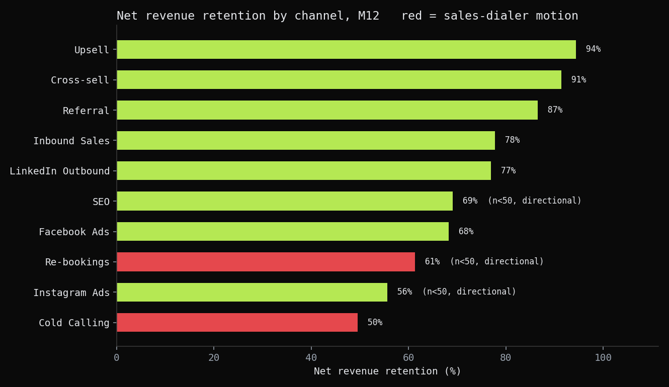 Net revenue retention at twelve months by channel. Expansion and referral channels retain 87% to 94% of the revenue they won. Cold calling retains 50%. The two outbound dialer channels sit at the bottom of the ranking.
This is the chart the original reporting did not produce. The original analysis stopped at the contract signature. This one continues past it. Cold calling wins less often and then loses half of what it does win within twelve months. Its 23.5% share of won revenue shrinks to 15.7% on a net revenue retention basis. The warm channels show the opposite pattern: higher win rates and revenue that stays. Win rate and twelve-month retention rank the channels in nearly the same order. On a real dataset, two independent measures agreeing would tell you the conclusion is not driven by a single metric. In this synthetic version the agreement is built into the model, so the takeaway is the method of cross-checking one axis against another, not the figures themselves.
To check whether the retention gap was an onboarding issue or a customer-fit issue, I plotted the survival curve by channel group.
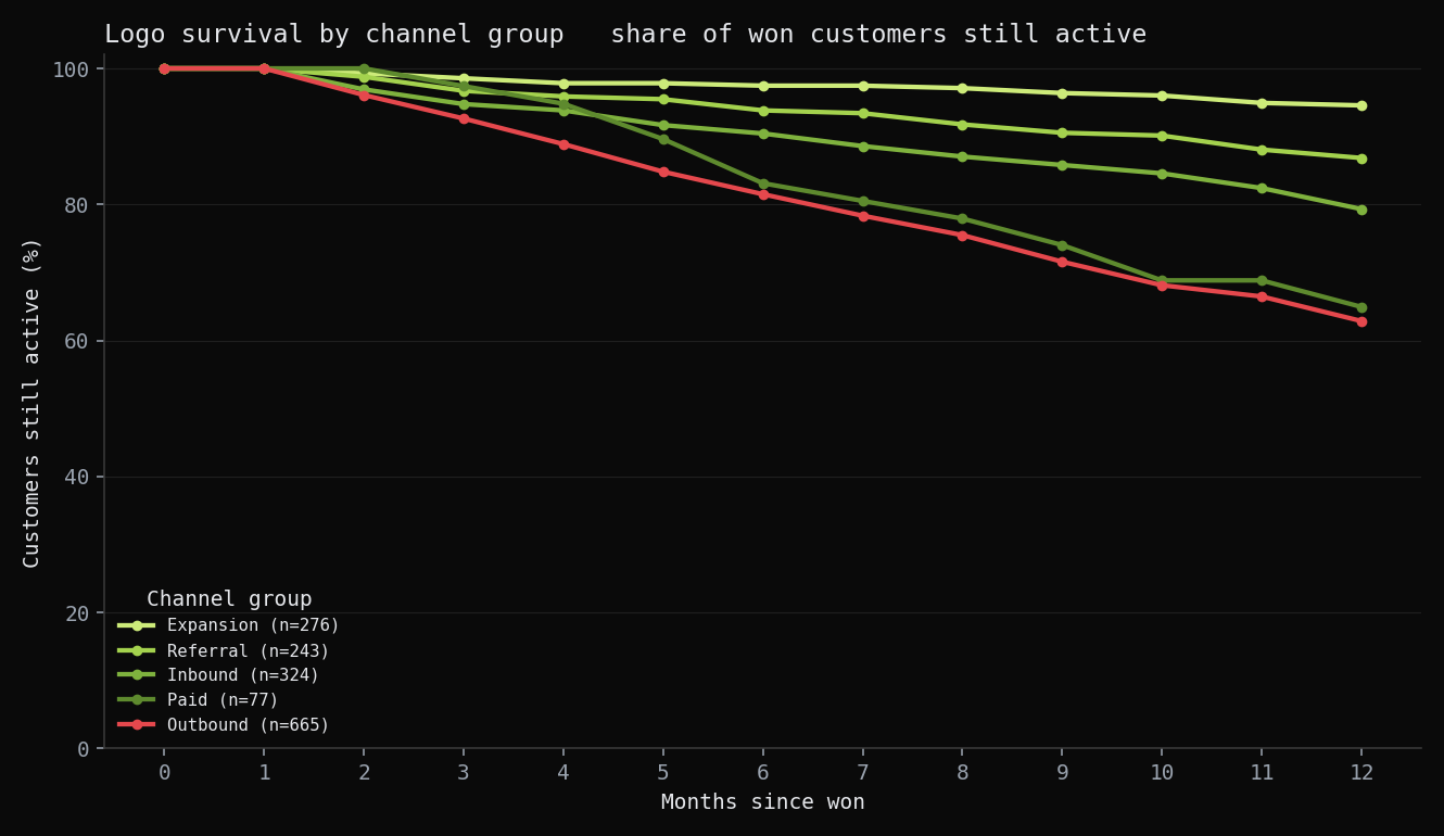 Share of won customers still active by month since the deal closed, grouped by channel type. The x-axis is months retained. Expansion customers stay near 100% retention across all twelve months. The outbound dialer line declines from the first month and continues declining without leveling off.
The survival curve shows that the retention gap is not a late-stage drop-off that better onboarding could address. The outbound line separates from the others in month one and the gap widens from there. Early-stage attrition that does not stabilize points to a customer-fit problem at the acquisition stage rather than a retention failure post-sale. That distinction matters because it changes the recommendation, from “improve onboarding on this channel” to “stop scaling this channel”. On a real dataset the survival shape is what surfaces that distinction. Here the shape is constructed to show the method, so the takeaway is the cross-check itself, not the specific result.
The fourth cut was time-to-won by channel, to check whether speed cut the same direction as win rate and retention.
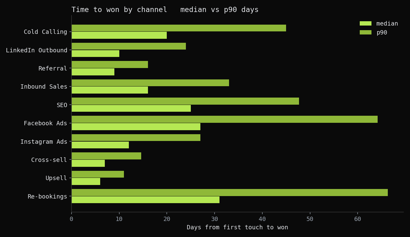 Median and 90th-percentile days from first touch to won, per channel. Expansion closes in under a week at the median. Cold calling takes 20 days, re-bookings 31, with long tails behind both.
All four cuts point in the same direction. The channels that win more often and retain more revenue also close faster, which means they free up sales-rep capacity sooner and can be re-engaged within the same quarter. The channels that win least and churn most are also the slowest, so a sales-rep hour spent on them buys fewer chances to close. On none of the four cuts does scaling the dialer channels further pay off.
The deliverable
The four measures combine into one additive scorecard. Each channel earns points on win rate, sales-rep capacity, time-to-won, and twelve-month retention. The total assigns the channel to one of four bands.
- Scale (LinkedIn, referral, inbound, cross-sell, upsell): 21% of deals, 69% of won revenue, 78% of the revenue that survived the first year, 83% retained at twelve months. Move sales-rep capacity here first.
- Maintain (Facebook, SEO, Instagram): 14% of deals, 7% of won revenue, mid retention. Hold spend, no new investment.
- Cap (cold calling): 60% of deals, 23.5% of won revenue that contracts to 15.7% on a net revenue retention basis, 91% of sales-rep dialer hours, 51% retained at twelve months. The volume is real enough that pulling the channel entirely would leave deals on the table, but the per-hour return does not justify scaling it further. Freeze the channel at current capacity, do not grow it.
- Kill (re-bookings): a 4.5% win rate on 312 deals. Stop it as a standalone motion and fold confirmed reschedules back into the channel that originally booked the meeting.
I built the retention factor as a positive-only bonus rather than a penalty. Win rate and sales-rep capacity already separate the channels into clusters; retention confirms the split rather than driving it. That keeps the rule defensible. It cannot be tilted by one strong quarter on a single measure, and the lead can defend every band assignment by pointing at the underlying numbers.
The scorecard is built so the revenue-operations lead can re-run it each quarter, defend each band to a CFO from the underlying measures, and reassign channels as the mix shifts.
What the sales team does with this:
- Move a third of the cold-call rep capacity to referral nurture, LinkedIn engagement, and inbound qualification.
- Freeze cold calling at its current volume. Do not grow it, do not kill it, the volume is real.
- Stop running re-bookings as a standalone queue; fold confirmed reschedules back into the channel that originally booked the meeting.
- Re-run the scorecard each quarter from the same tables, before the capacity review.
What I’d do differently
The first pass had no post-sale axis at all. The word “churn” was in the write-up, but it was standing in for “low win rate”, which is not churn. A channel that wins and then loses the customer in two months is a different and worse problem than a channel that wins less often, and the analysis could not tell them apart until retention went in. Adding it changed which channels looked safe. A channel can clear a respectable win rate and still belong in the cap band once you can see what happens after the signature. I should have built the post-sale view from the start instead of treating the contract as the finish line.
The smallest channel, re-bookings, has only fourteen won customers. Its retention number is too thin to carry a recommendation, so the kill verdict rests on its 4.5% win rate over 312 deals, not on the fourteen-row retention figure, and it is flagged as small-sample everywhere it appears. A real engagement would run the window longer to give that channel a sample worth a decision rather than a direction.
Tools, by step
The same tools most analysts list, but used at a specific step for a specific reason:
| Step | Tool | What it did here |
|---|---|---|
| Sourcing | CRM export (synthetic stand-in via a seeded Python generator) | Deals, touches, and meetings at CRM grain; no private data leaves the original engagement |
| Modelling | SQL (Postgres-style DDL) | The star schema: three fact grains, seven conformed dimensions, channel as the primary axis |
| Cleaning and validation | DuckDB | Referential-integrity checks (zero FK orphans), grain dedupe, query validation before any finding |
| Churn analysis | Python (pandas) | Twelve-month retention curves, net revenue retention, and survival shape by channel group |
| Analysis | Python (pandas, numpy) | The four-factor scoring across win rate, sales-rep capacity, time-to-won, and churn, plus a verification script that recomputes every quoted number |
| Dashboard | Power BI (PBIP/TMDL, validated headless with pbi-cli) | The channel scorecard as something the revenue lead reruns each quarter |
| Reproduction | One seeded script | The whole pipeline regenerates identically from source on every run, with no real client data |
Every chart in this case study is a bar or a line. One comparison type. No chart requires a second visual encoding to interpret.
Want the technical deep-dive? Full code, queries, and reproducible analysis live on GitHub.
View on GitHub →