Invoice & Financial Dashboard
One trusted view of profit per product, profit per customer, and the money owed. Built from invoices and checked line by line against the accounts.
2024 revenue tied to the official accounts, the gap fully explained by currency timing. With the numbers trusted, gross margin per seed variety, customer profitability, and accounts receivable became visible on a single live view.
Built for Veginova, a seed business selling tomato, pepper, and nightshade varieties across Europe and the Middle East. The reconciliation in this piece (the 2024 revenue match against the official accounts) is real. The commercial detail (per-product margins, customer profitability, receivables amounts) is illustrative: the shape and scale of the real findings, with the confidential client figures replaced. The method, and the result that mattered, are the real ones.
Pillars this case proves: commercial · close to the decision makers · data depth
Situation: three questions no report could answer
Leadership at Veginova, a family-owned seed company, asked three questions no report could answer:
- What’s the real gross margin on each seed variety?
- Which customers drive profit, and which just drive volume?
- How much money is owed to us right now, and when will it arrive?
Three decisions hang on those answers: which varieties to push, which customers to prioritise, and which invoices to chase. The ask came straight from the people running the business, not from a reporting backlog.
Task: produce one revenue figure the owner would sign his name to
The deliverable was a dashboard. The actual requirement was narrower and harder: one revenue number, reconciled to the audited ledger, with the gap between the two sources explained line by line rather than waved at.
Three constraints came with it. It had to run on the existing e-conomic export, with no new bookkeeping process. It had to survive a fresh data load without silently drifting.
And it had to attribute cost per variety, which the official accounts do not do at all.
What the data looked like before
Like many small businesses, Veginova’s numbers lived in two places that didn’t agree. The official accounts were structured for tax, which meant they hid the real commercial picture. The invoices held the record of what was actually sold, to whom, at what price, but nothing proved the two sets of numbers tied together.
The accounts said one thing. The invoices said another. Nobody could trust a single number, and you can’t make a commercial decision on a number you don’t trust. That distrust is common at this level. In a 2024 BlackLine survey of more than 1,300 finance leaders, nearly four in ten CFOs said they don’t completely trust their own organisation’s financial data. Veginova was living that problem.
Action: made the invoices the source and the accounts the cross-check
I made one decision that shaped everything: the invoices are the truth. They’re the record of what was actually sold, to whom, at what price. The tax accounts became a cross-check, not the source.
The path from source to screen: raw invoice Excel exports land in a Postgres staging layer, SQL transforms them into a star schema at invoice-line grain, a reconcile gate proves the total ties to the official accounts before anything publishes, and Power BI reads the finished mart and aggregates. The logic lives in the data layer, not in the report, which is what lets it reconcile and stay trustworthy.
The system:
- Pulled every invoice down to the line item: product, customer, price, cost
- Reconciled the invoice revenue against the official accounts to prove the numbers tied out
- Calculated gross margin per seed variety and profit per customer
- Tracked accounts receivable: what’s owed, how old it is, when it’s expected
There’s a deliberate limit here, and it’s an honest one: the dashboard measures contribution margin (revenue minus the direct cost of the seed), not bottom-line profit. Overhead lives in the bookkeeping system, and rebuilding it here would just duplicate the official accounts. So the margins below are contribution, the number that tells you which products carry the business, not statutory profit.
The full technical detail (the model, the ingestion, the gate, the DAX) is in “How it’s built” at the bottom.
Result: 2024 revenue tied to the audited figure, and it stays tied
The one that matters: 2024 revenue tied to the official accounts, and the remaining gap was fully explained by currency timing, not error. That match is the whole foundation. It’s the difference between “here’s a number” and “here’s a number you can act on,” and it’s the first thing a finance reader should be told: it ties out, and the proof is one click away.
With trustworthy numbers, the commercial picture finally became visible:
- Gross margin per product. The seed lines spread far wider than leadership assumed. The top varieties carried a contribution margin around 90%, while a handful of lines sat closer to 60% once their real cost was attributed.
- Customer profitability. Roughly a fifth of customers generated about three-quarters of the contribution.
- Accounts receivable. Around 1.2M DKK was outstanding, of which roughly a quarter had aged past 90 days and was quietly at risk.
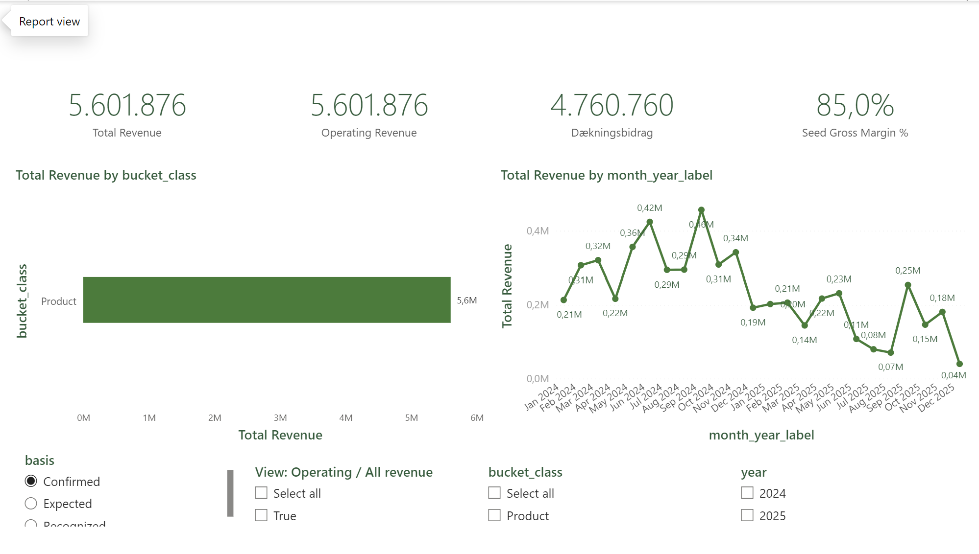 Total and operating revenue, contribution margin, and margin percentage, with revenue by month against revenue by bucket. The reconciliation result sits behind the revenue figure: leadership is told it ties out; the detail is one click down. The real Power BI dashboard, shown on illustrative data.
What changed
- One number instead of three. Leadership stopped second-guessing the figures and started deciding from them. The single biggest change, and the one that made everything else usable.
- Reporting that used to take the better part of a day each month now refreshes on its own.
- Profit visible per product and per customer for the first time. The data needed to decide what to grow, what to drop, and who to keep.
- Receivables made visible surfaced overdue invoices that had been sitting unchased, cash the business was owed but couldn’t see.
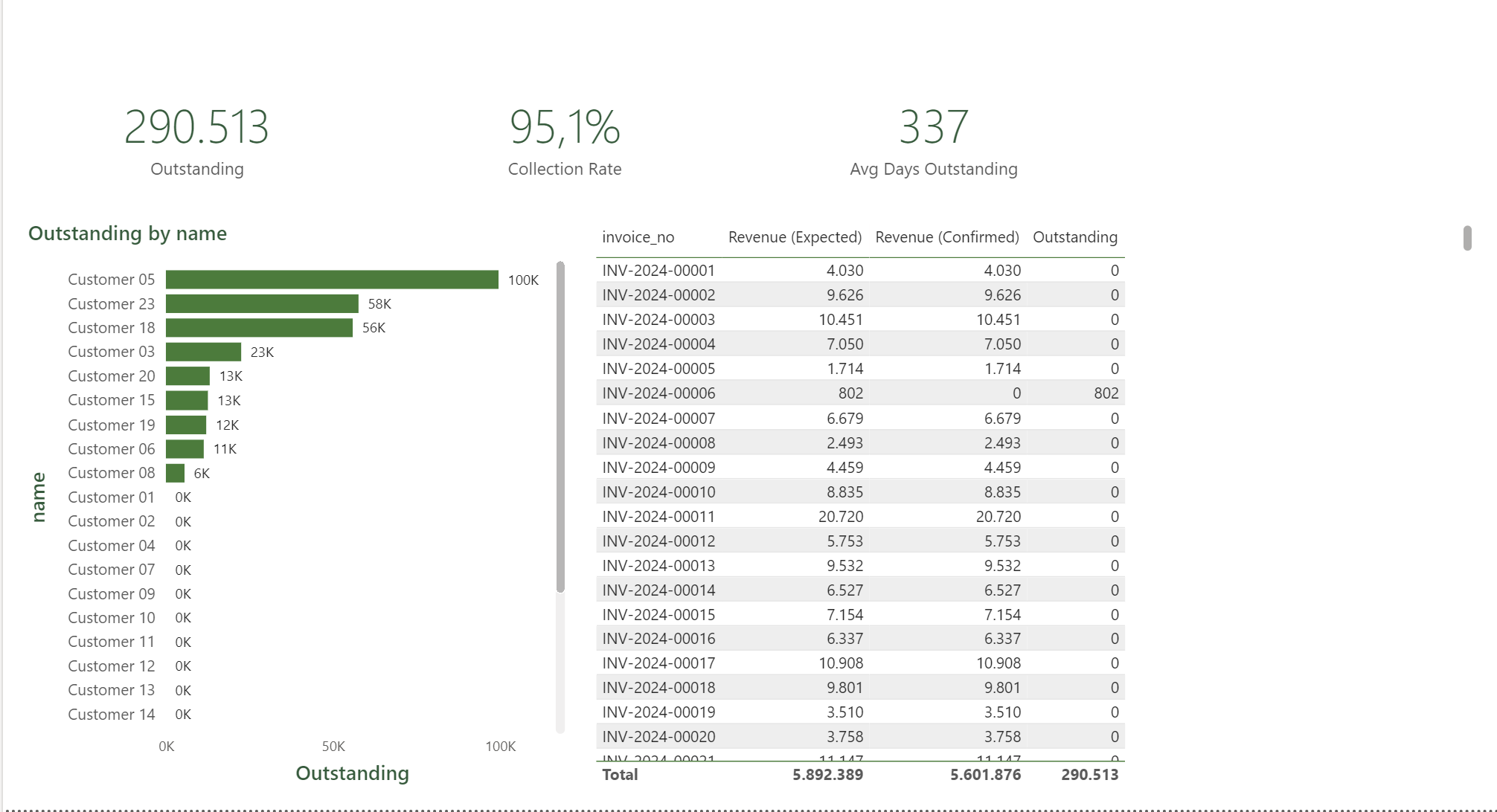 Accounts receivable by customer and invoice. What used to require manual cross-referencing across spreadsheets is now a glance: what’s owed, the collection rate, and days outstanding. The real Power BI dashboard, shown on illustrative data.
Leadership can answer the questions that were guesswork before: which varieties to push, which customers to prioritise, and where the cash is.
The recommendation that came out of it: concentrate commercial effort where the contribution is. Push the high-margin varieties, protect the small group of customers driving most of the profit, and tighten collection on the invoices aged past 90 days, where the cash is most at risk. None of those calls were possible while the numbers were in dispute. The dashboard didn’t just report the business. It settled which number was real, and that’s what turned reporting into decisions.
What it does not do
The parts worth knowing before believing the rest.
It measures contribution margin, not profit. Revenue minus the direct cost of the seed. Overhead stays in the bookkeeping system, because rebuilding it here would duplicate the official accounts. Contribution tells you which varieties carry the business. It does not tell you whether the business made money.
Part of the forward view rests on a price assumption. Forecast revenue is derived at historical prices and is not booked. It is labelled as derived everywhere it appears, and it is not a commitment.
There is a gap in 2026. Invoices for January to July 2026 are not loaded, so any period crossing that window is incomplete rather than zero. The report says so on the page, not in a footnote.
A chatbot was specified and I refused to build it. The proposed design reached the database through a service_role key and an exec_sql wrapper capable of running DROP. A natural-language layer with that much authority is one prompt away from dropping a table, and no amount of prompt filtering fixes a permission model. It needs a read-only role and a query allow-list first. That work has not been done, so the feature does not exist.
Saying that out loud costs a feature. Building it would have cost the client their data.
Stack and role
Built end-to-end, solo, close to the decision makers. I sat with the people who use the numbers, not at the end of a ticket queue: the questions came from leadership, the answers went straight back to them, and every layer in between is mine.
Power BI · PostgreSQL · SQL · Python · Supabase
How it’s built
For the technically inclined, here’s how it’s actually built. Everyone else can stop here, the business story above is the point.
The principle behind the whole system: the logic lives in Postgres and SQL, and Power BI renders only. That single decision is what lets the numbers reconcile and stay trustworthy. A dashboard with the logic baked into DAX measures becomes its own source of truth, impossible to cross-check against the books. With the logic upstream, every number on the screen traces back to a row in the database that was reconciled before it ever reached the report.
The architecture. Source files flow through five stages: raw Excel exports → staging (a faithful mirror of the source) → a dimensional model (dimensions plus facts) → a reconcile gate → the mart the report reads. Power BI connects to the mart and aggregates, nothing more.
The data model. A star schema with fct_revenue at invoice-line grain (276 lines across 27 customers and 31 products). Each row is one line on one invoice. Four dimensions hang off it: dim_date, dim_customer, dim_product, dim_bucket. A fifth table, ref_revenue_basis, is a disconnected slicer that drives a revenue-basis toggle (Expected, Confirmed, Recognized). Keeping firmographic and product attributes on the dimensions, not the fact, means every measure can cut by product, customer, or bucket without rewriting a query.
The Python ingestion. The loader reads the reconciled invoice workbook (already bucketed, FX-converted, costed and paid-flagged), locates fields by header text rather than fixed cell positions, and rebuilds the staging table idempotently:
def load() -> int:
    """Rebuild stg_invoice_lines from the workbook (idempotent: truncate + insert)."""
    rows = parse()
    _db.truncate("stg_invoice_lines")
    return _db.insert("stg_invoice_lines", rows)
Truncate-then-insert means a re-run always produces the same table from the same source. No drift, no half-updated state. The build step then transforms staging into fct_revenue, deriving the bucket classification, the seed-revenue flag, and the confirmed-vs-expected amounts per line.
The reconcile gate, the part that makes the numbers trustworthy. Invoice revenue is tied to the official 2024 ledger figure, and the unexplained remainder is gated at half a percent:
LEDGER_PRIMAER_2024  = 2312690.21   # official 2024 primær revenue
RECONCILING_ITEMS_2024 = 28805.41   # documented EU FX/timing
UNEXPLAINED_TOL      = 0.005        # 0.5% gate on the unexplained remainder

residual    = LEDGER_PRIMAER_2024 - invoice_revenue_2024
unexplained = residual - RECONCILING_ITEMS_2024
ok = abs(unexplained) / LEDGER_PRIMAER_2024 <= UNEXPLAINED_TOL   # OK / FAIL
The gate separates explained divergence (documented EU FX and timing differences) from unexplained divergence, and only the unexplained part has to clear the tolerance. That distinction is the difference between “the numbers are roughly right” and “every krone of the gap is accounted for.” If a future data load breaks the tie, the gate fails before the number reaches a chart.
The Power BI layer. The measures are thin. They aggregate the columns the pipeline already computed. The revenue measure is a basis toggle, not a calculation:
Revenue =
SWITCH(
    SELECTEDVALUE('ref_revenue_basis'[basis], "Expected"),
    "Expected",   SUM(fct_revenue[amount_dkk_expected]),
    "Confirmed",  SUM(fct_revenue[amount_dkk_confirmed]),
    "Recognized", CALCULATE(SUM(fct_revenue[amount_dkk_expected]),
                  USERELATIONSHIP(dim_date[date_key], fct_revenue[recognition_date]))
)
Dækningsbidrag = [Revenue] - [COGS]      // contribution margin
Outstanding    = [Revenue (Expected)] - [Revenue (Confirmed)]   // receivables
Contribution is revenue minus cost. Outstanding is expected minus confirmed. The complexity (cost attribution, the paid flag, the reconciliation) all happened upstream in the pipeline, so the report stays simple enough that a reviewer can verify every measure by reading one line.
The code (sanitised, with illustrative data) is on GitHub.
Want the technical deep-dive? Full code, queries, and reproducible analysis live on GitHub.
View on GitHub →